Next
I established where Zing stood against WCAG AA with a cross-platform accessibility audit, then led the work to close the gaps—notably around VoiceOver and TalkBack: reading order, grouping, labels, and interaction semantics. I partnered with designers to bake accessibility into the design system so components shipped with consistent roles and reading order by default.
I drove improvements to colour contrast across light and dark themes, navigation clarity, typography, and dynamic type—then ran a single shared backlog in Figma with engineering so accessibility work was visible, prioritised, and shipped on a weekly cadence alongside feature delivery.
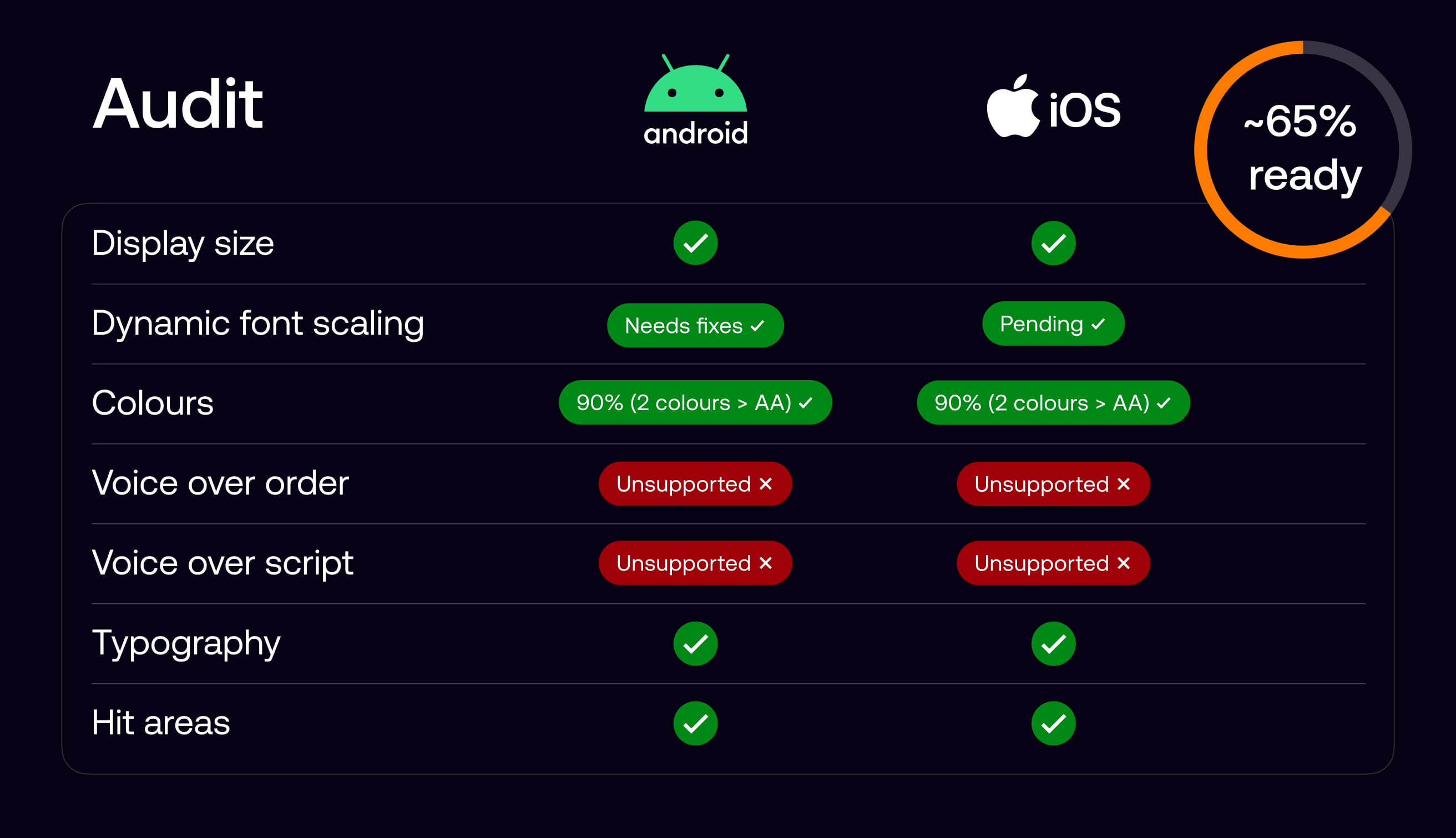
While accessibility was considered from the outset, we wanted a clear and honest view of where the product stood against AA standards. We began with an accessibility audit across Android and iOS, which showed that most core visual and interaction foundations were in place, putting the product at roughly 65 percent readiness.
The main gaps were in screen reader support, particularly voice-over order and scripting, requiring deeper design and engineering work. I then led the effort to systematically close these gaps with the design team and managed delivery with a core group of engineers.
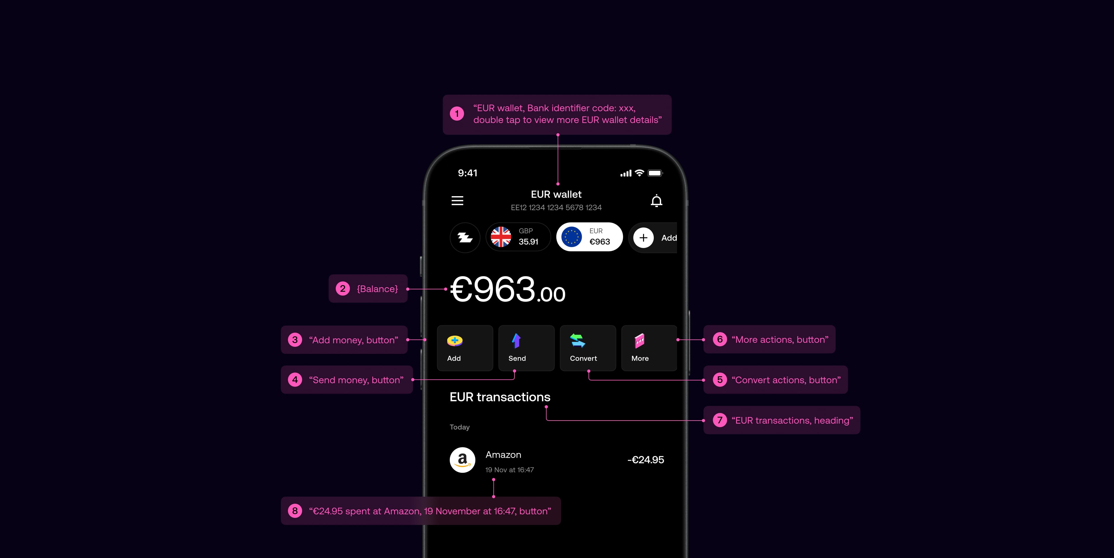
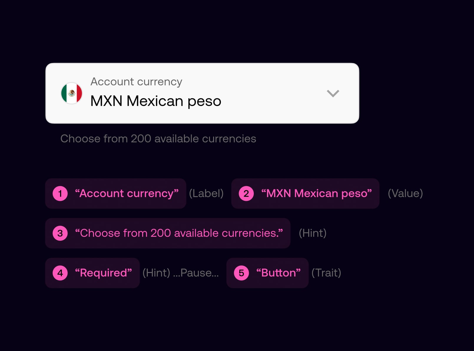
We defined voice-over behaviour for key screens by specifying reading order, grouping, labels, and interaction cues, and carried this through to handoff as part of standard design documentation.
This ensured the spoken experience aligned with the visual hierarchy and user intent, giving screen reader users a predictable and usable journey, while providing engineers with clear, implementable guidance.
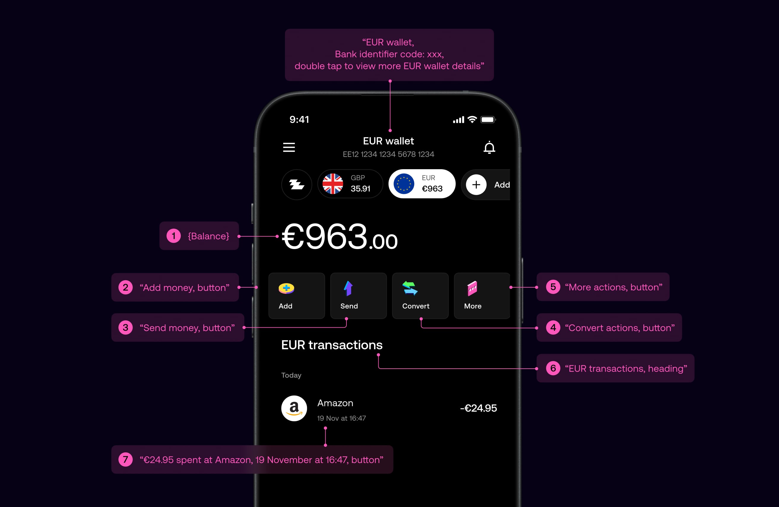
All components in the design system were defined with consistent accessibility semantics, including labels, roles, and reading order. This enabled designers to assemble screens confidently, knowing components would be read correctly by screen readers by default.
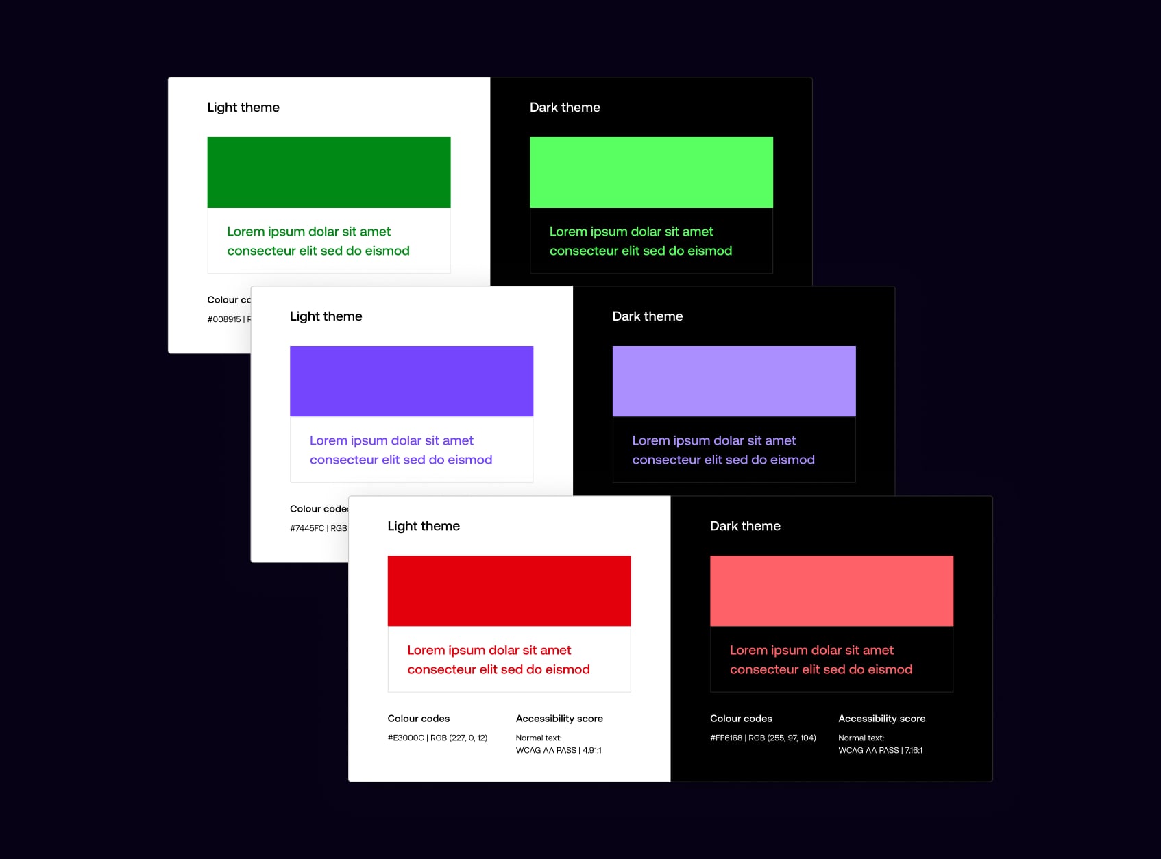
We reviewed colour contrast across light and dark themes to ensure every token met WCAG AA standards, refining the colour system, resolving edge cases, and ensuring consistent contrast across the product.

Light and dark themes were reviewed independently, with colour tokens adjusted to ensure legibility across backgrounds, states, and components, while preserving visual balance in each theme.
Navigation was designed to be simple, predictable, and easy to understand across the product. We focused on clear hierarchy, familiar patterns, and supportive copy to help users move confidently through key journeys, reducing cognitive load and minimising the risk of error, particularly in sensitive or high-impact flows.
All interactive elements were designed with generous tap targets and sufficient spacing to support accuracy and ease of use. Buttons and links meet minimum size guidelines, with clear visual affordances to indicate interactivity. This improves usability for all users, while particularly supporting those with motor impairments or reduced dexterity.

Journeys were structured using consistent layouts and language, with clear intent communicated at each step. Destructive or irreversible actions are protected by confirmation dialogues, ensuring users understand the outcome before proceeding. This approach balances efficiency with reassurance, helping users navigate confidently without accidental actions.
Typography was designed to create clear hierarchy and maintain legibility across all screens. We established consistent type scales, spacing, and content structure so users can easily scan, understand, and act on information, regardless of context or screen size.
We established clear relationships between headings, subheadings, and body copy to guide attention. A highly legible variable typeface supports a wide range of sizes and weights, maintaining clarity when scaled and preserving visual balance and readability across the product.
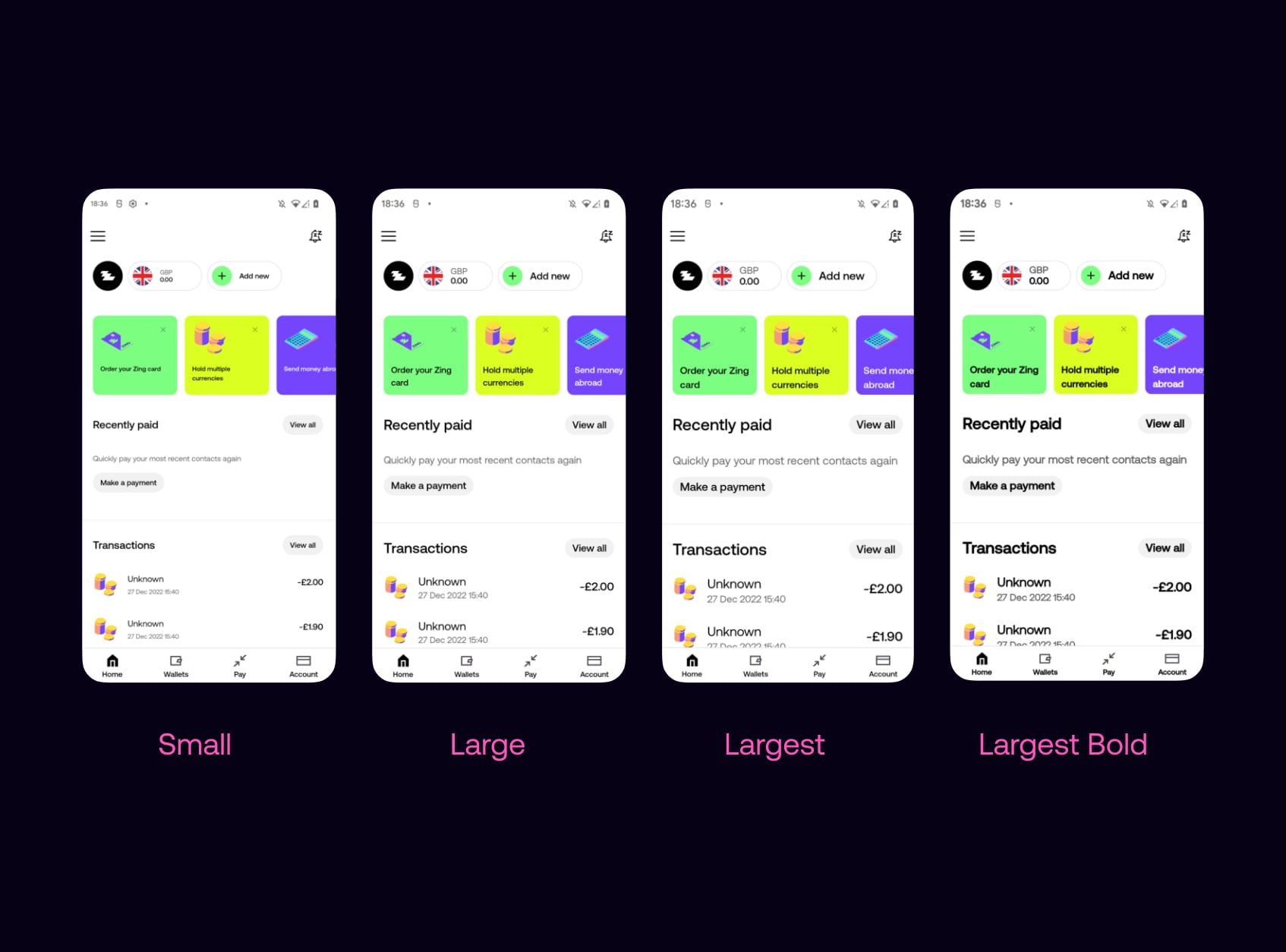
The app supports dynamic font scaling on both iOS and Android, allowing text to scale with system settings. Layouts were designed and tested across multiple size ranges to maintain hierarchy, prevent clipping, and preserve usability, even at larger accessibility sizes.
We validated key flows against larger display zoom and density settings so that when users scale the system UI, layouts remained readable, tappable, and free of clipping—without breaking the intended hierarchy.

I led accessibility delivery by creating a single, shared backlog of design and engineering work in Figma across iOS and Android. This clarified priorities and made progress easy to track.
Working closely with designers and engineers, we reviewed and progressed items on a weekly cadence, ensuring accessibility improvements were consistently designed, built, and delivered.
