Next
I led visual direction end to end—from app to marketing and social—and owned most of our design guidelines, with a visual designer, copywriter, and product designers helping evolve and apply the system. Our product principles—Dynamic, Authentic, Helpful, and Transparent—were the same bar we used for illustration, icons, and campaigns.
I set strategy and quality for our icon and illustration language; an illustrator I worked with built out the full set and deepened the style, while I steered direction and critique. Product designers applied the system across the app. I defined intent for motion; our illustrator and animator delivered the assets. I also shaped social templates and modular USP visuals for campaigns.
I led the creation of our design guidelines, working closely with a visual designer and copywriter to keep the system evolving as the brand matured. I designed most of the guidelines myself, coordinating with product and visual designers to define clear rules, visual strategies, and usage patterns across every touch point. This process helped the team stay aligned, remove inconsistencies, and maintain a consistent standard of quality as the product expanded.
I led the visual direction for our icon and illustration systems, setting a unified style that reflected our angular brand elements and supported both product clarity and brand expression. We held the work to the same principles used across Zing—Dynamic, Authentic, Helpful, and Transparent—so visuals could be critiqued and justified on shared terms, not treated as decoration.
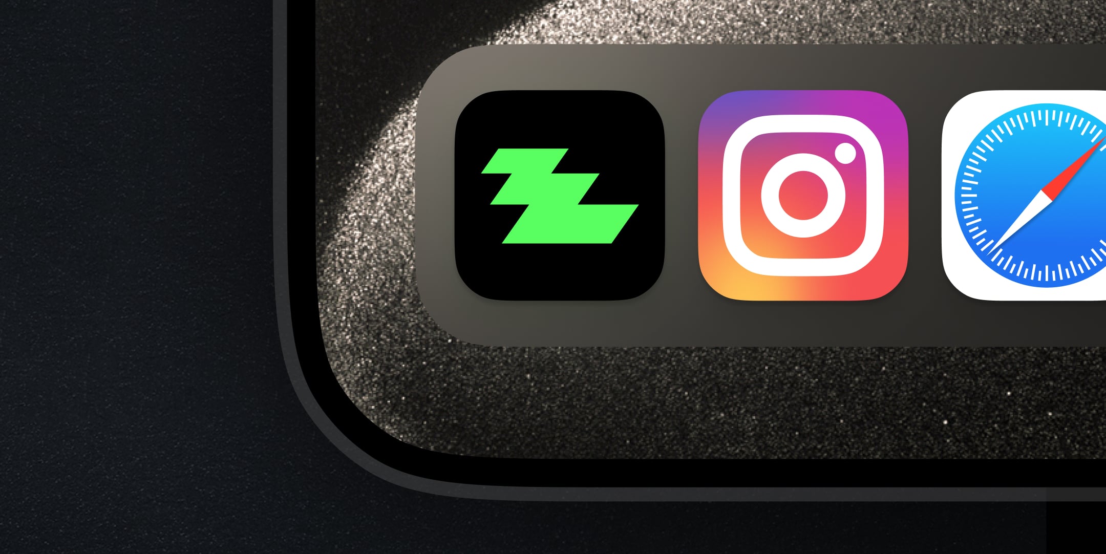
We defined the structure and visual rules for our icon set, using our signature 35 degree angles to keep everything aligned with the core brand geometry. The icons were designed to stay clear and functional in mobile UI views, expanding gradually as the product grew while maintaining a consistent, readable style. Product designers and I applied them together across flows as the surface area grew.
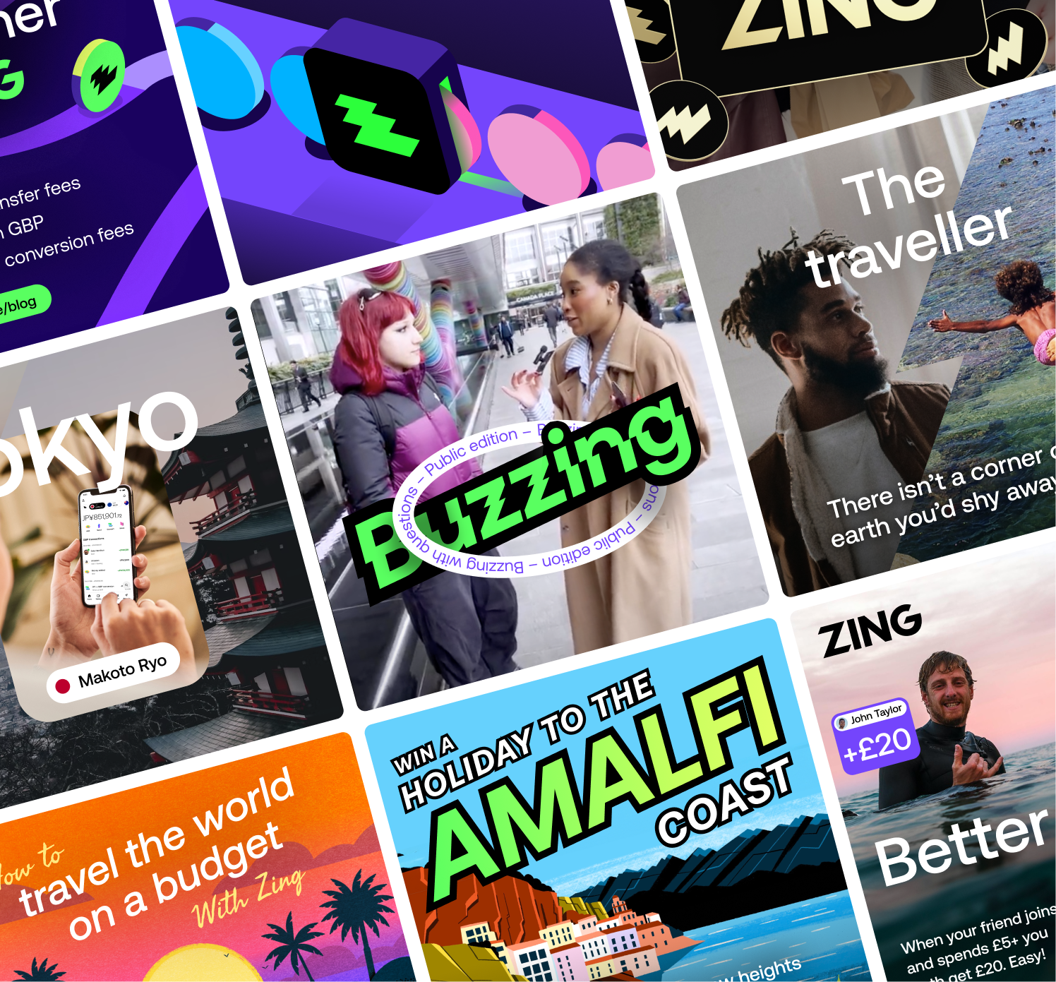
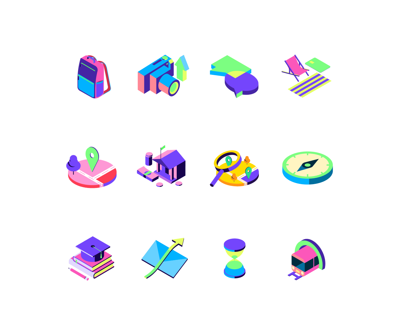
I led the visual direction for our illustration system—framing strategy, references, and a high quality bar—and shaped the isometric language that became the foundation for both product and marketing work. The illustrator I collaborated with created the full set and carried the style forward as we expanded: product scenes, richer marketing treatments, and a sticker style for complex backgrounds. I stayed in the loop with critique and course-correction so the work stayed on-brand and usable; they owned production and craft execution.
I set direction for where and why motion should appear; our illustrator and animator built the assets to bring the system to life with subtle movement that supported the user journey. These animations helped soften moments like onboarding and KYC checks, and guided users when their flow shifted or extra steps were needed. The movement stayed light and purposeful to draw attention to key messages without adding noise.
I played a very hands-on role guiding our visual designers, setting up templates, creative direction and standards that balanced flexibility with consistency. I worked closely with the team to explore a wide range of visual styles while keeping key themes and elements aligned. This process evolved in parallel as I led the development of our brand and voice guidelines while the marketing strategy expanded across more use cases.
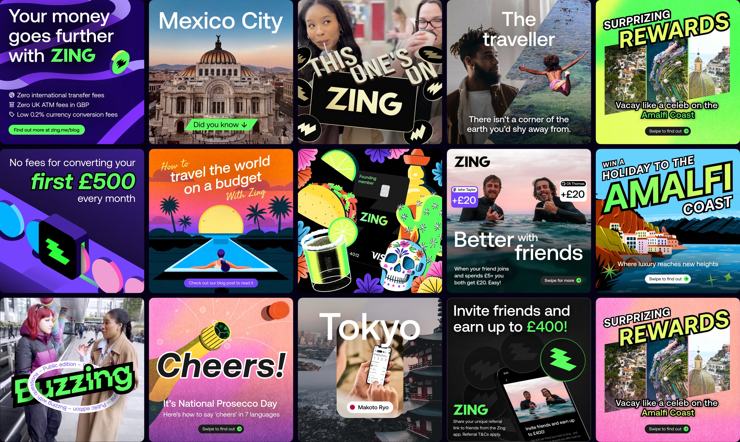
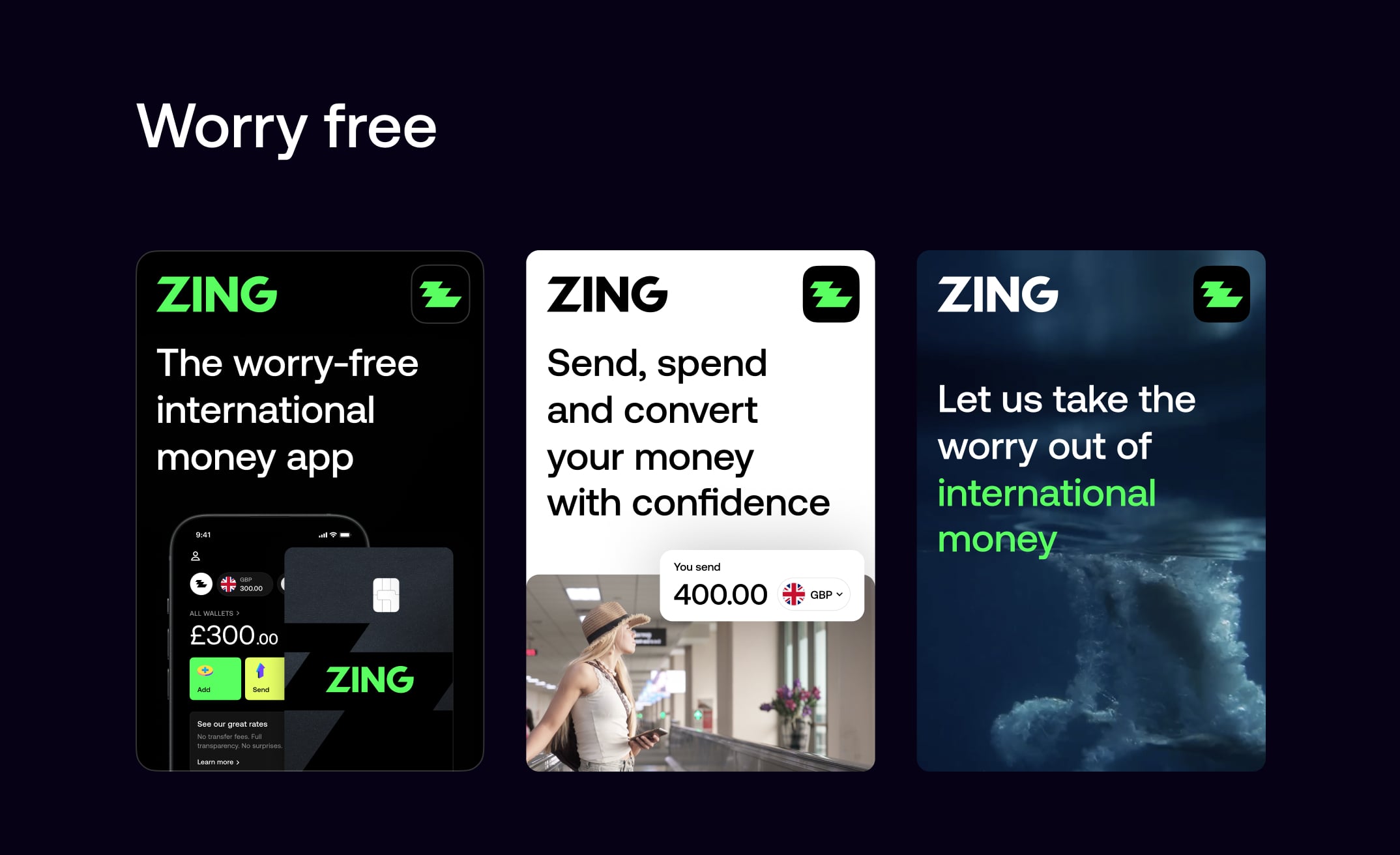
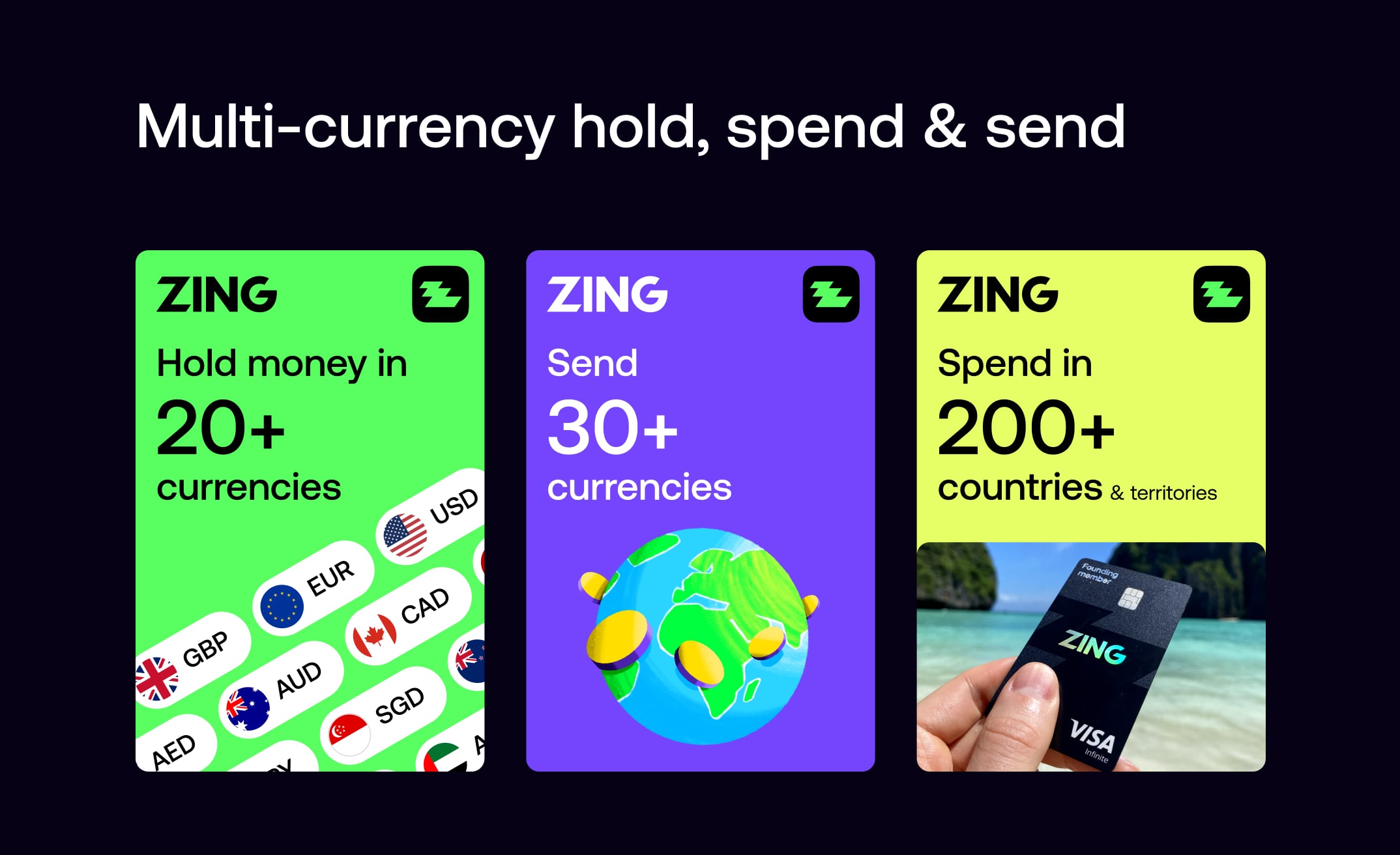
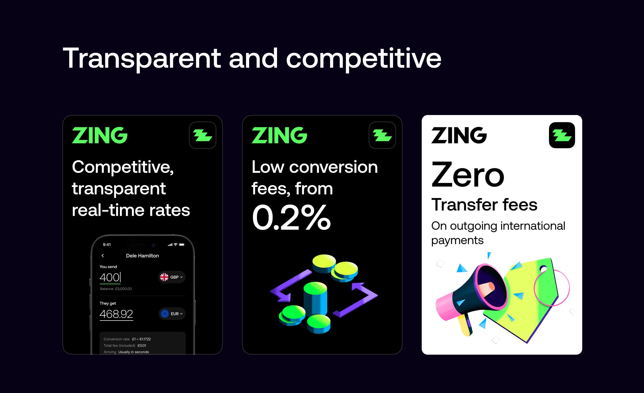
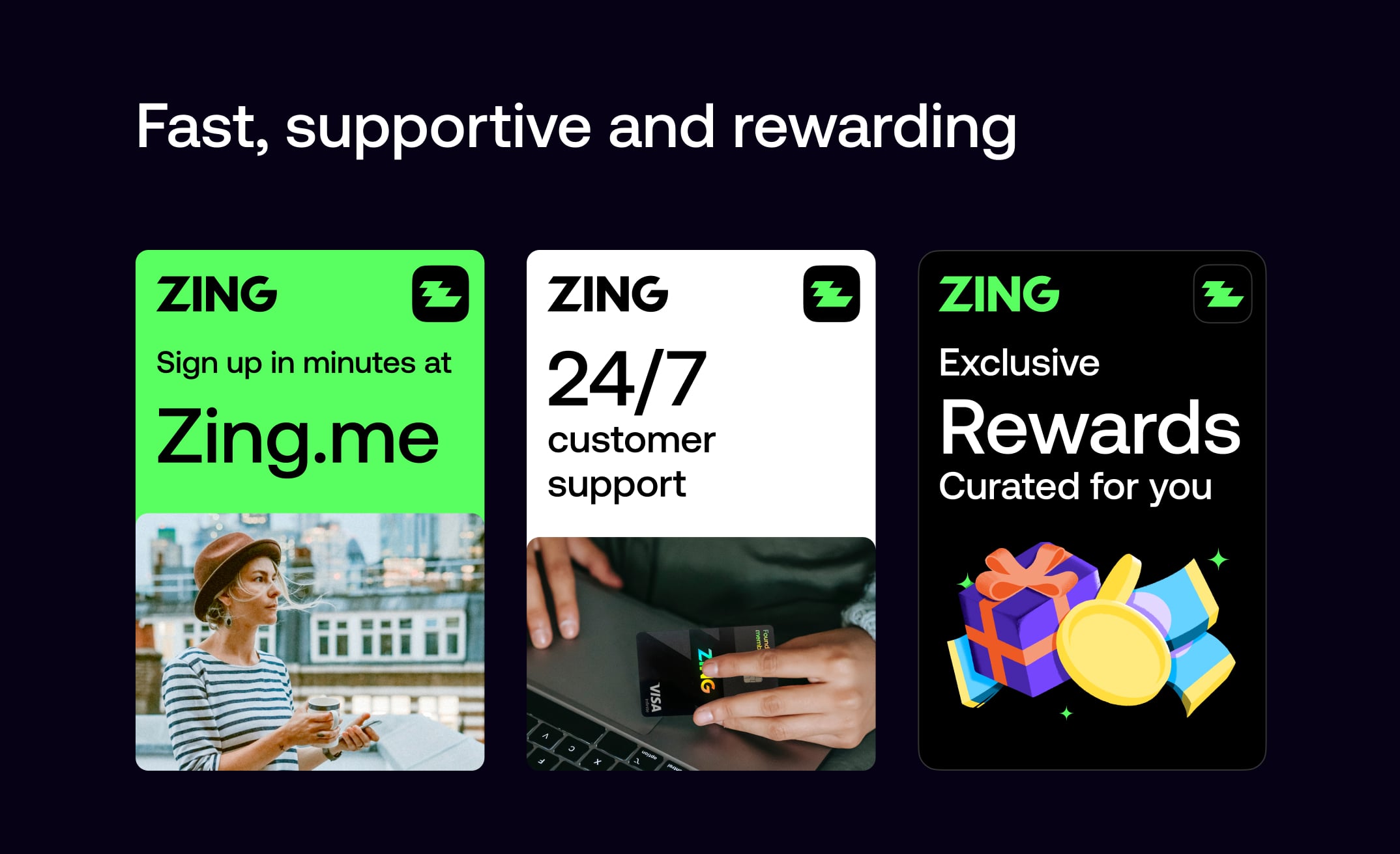
We created our unique selling propositions visually in modular formats that could be animated and displayed in succinct, easy-to-digest ways across both digital and printed formats. This modular approach made it immediately clear to customers how Zing is different and better than other competitors in the market, communicating our value proposition effectively wherever it appeared.