Upon joining Monese I was tasked to lead a company rebrand which would lay strong foundations for it’s rapid future growth. The goal of the new brand was to position Monese’ identity in the market in a way which reflects it’s unique offering and ethos.
I began the project by investigating new brand values and visual concepts, to the design of a fully unique brand system consisting of a new logo, colour palette, typography, illustration, iconography, photography, and a full product redesign. All of which would later form the core brand identity for many years to follow.
Brand design
And setting standards
Brand guidelines
With clear documentation
Brand guardianship
Quality and consistency
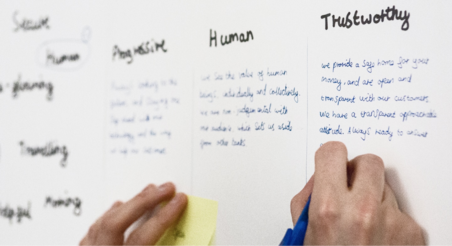
Defining a set of brand values was a really important first step for us as it gave us a solid base to judge all future design decisions against. To create our values I connected with everyone across the business and asked everyone to come up with the values they believe represent Monese. From this we then distilled the results down to 3 top values: Progressive, Human and Trustworthy.
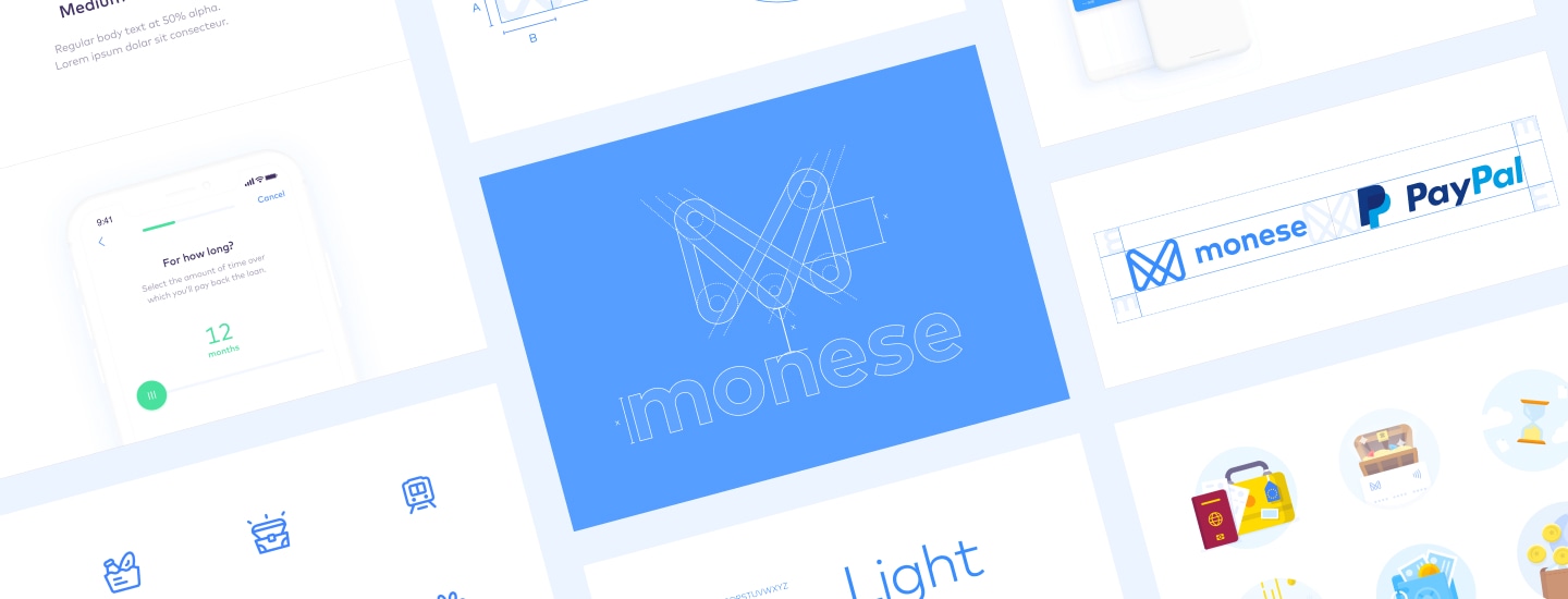
The Monese logo features a series of flowing and interconnecting lines which overlap each other to represent a secure and dynamic network, whilst maintaining a friendly human feel. Its flowing linear form pays homage to the filigrees found printed in physical paper money across the world.
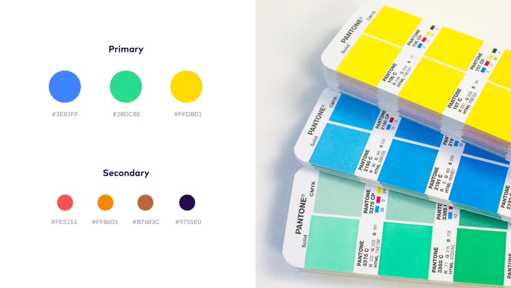
I wanted our palette to have a uniquely energising feel, whilst choosing colours that could clearly communicate elements of the banking service across all languages. We chose a vibrant green, bue and yellow, taking care to ensure they could work clearly on both a dark and light background.
I chose a secondary palette, taking into account the various states of information we would need to communicate within the application such as errors and warnings.
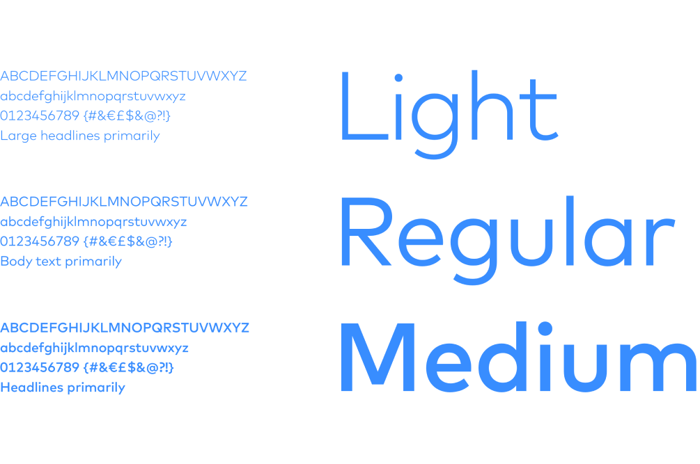
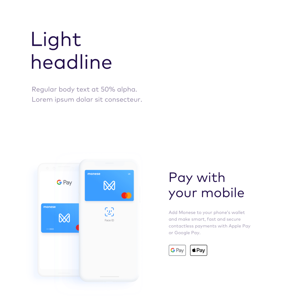
Our typeface – FF Mark – was chosen for it's carefully crafted glyphs that give it a strong, simple and bold edge with a reassuring and friendly feel, which help to marry it well with the rounded forms of the Monese logo mark.
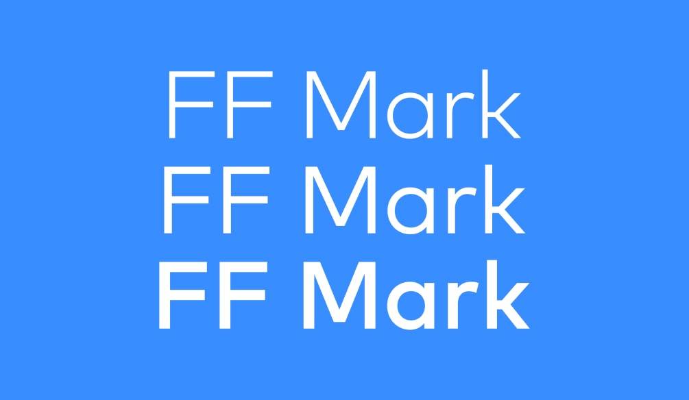
A large part of our audience are non-native English speakers, meaning legibility is paramount to our typographic communication. FF Mark’s large x-height helps it work clearly in small sizes within user interface elements. We use three weights of FF Mark to allow for a clear hierarchy and consistent look and feel across our communications.
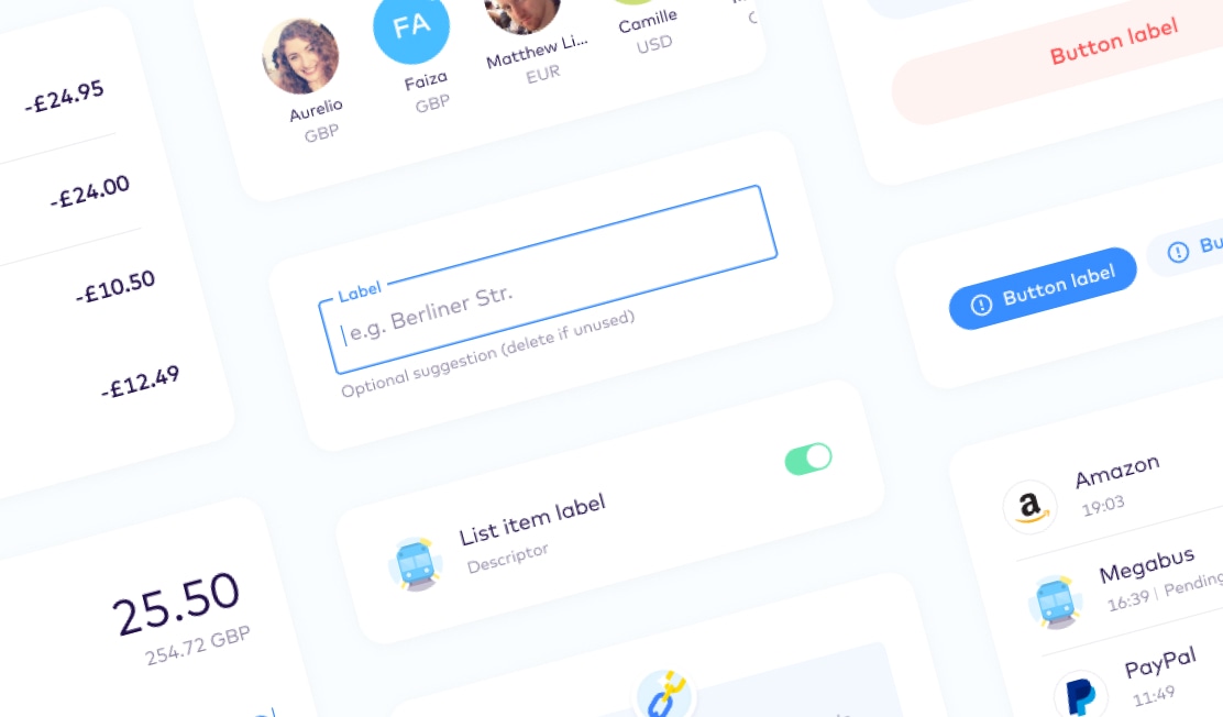
Our iconography style plays off the rounded, friendly and human forms from the Monese logo, and retains a consistent line weight throughout the entire set. We worked meticulously to craft each icon to embody a sense of character, whilst ensuring not to be too intricate so as to ensure clarity and visibility on small screen sizes and lower resolutions.
Our illustrations are some of our most valuable brand assets, used to deliver a quick message to our users when their time is limited. We know how little users like to read long streams of body text, especially if they’re on the move. With this in mind, we try to include a sense of playful character in our illustrations. This helps the message land with our users in such a way that lightens the mood of what could otherwise feel like a piece of dry messaging that you’d find in many traditional banking applications.

Finance is a huge part of our daily lives, and we aim to capture the natural essence of life within the photography we use within our communications. Including images of normal people in an unstaged environment in their normal clothes going about their normal lives can lead to excellent photographs when taken at the right moment from angles that are outside of the ordinary you’d expect. We aim to take these natural lifestyle shots to help to build a brand that feels relatable and trustrworthy.