
Next
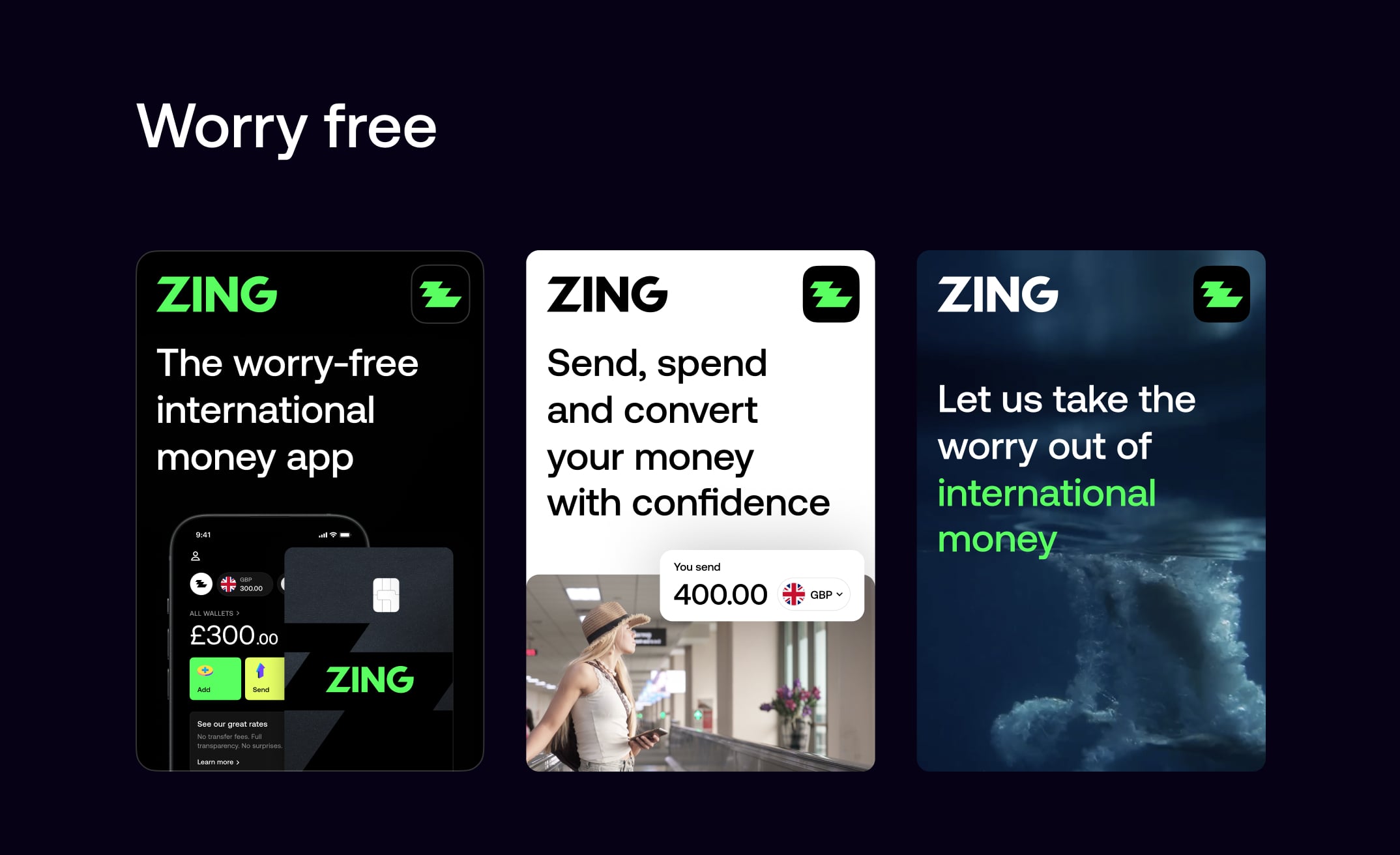
Zing is a global money app built in partnership with HSBC to make international money management simple, transparent, and worry-free.
From initial concept to public launch and beyond, I shaped the product's core experience, designing the journeys that enable users to hold, send, receive, and spend money seamlessly across currencies with confidence and ease.
I led the end-to-end design delivery of Zing from early proof of concept through Alpha, Beta, and public launch, shaping a clear and coherent product experience from a complex initial vision while working closely with senior stakeholders.
Alongside building and guiding a lean, high-performing team, I remained hands-on with design craft, including personally designing the debit cards and unboxing experience with manufacturers, helping establish a distinctive and premium presence in the market.
From Pitch to Partnership
Leading the design vision and presenting to HSBC leadership.
Zing was born from the vision of combining Monese's innovative fintech expertise with XYB's cutting-edge technology platform. Together, we're creating the future of digital banking.
We crafted a compelling pitch that showcased our strategic approach to product design — demonstrating how we would bring Zing's vision to life through thoughtful user experience and innovative features.
Multi-currency account
Virtual and physical cards
Digital asset tracking
Crypto watchlist functionality
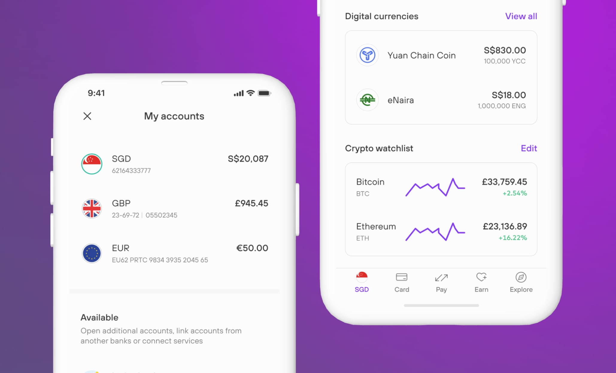
Global currency balance
We crafted a compelling pitch that showcased our strategic approach to product design — demonstrating how we would bring Zing's vision to life through thoughtful user experience and innovative features.
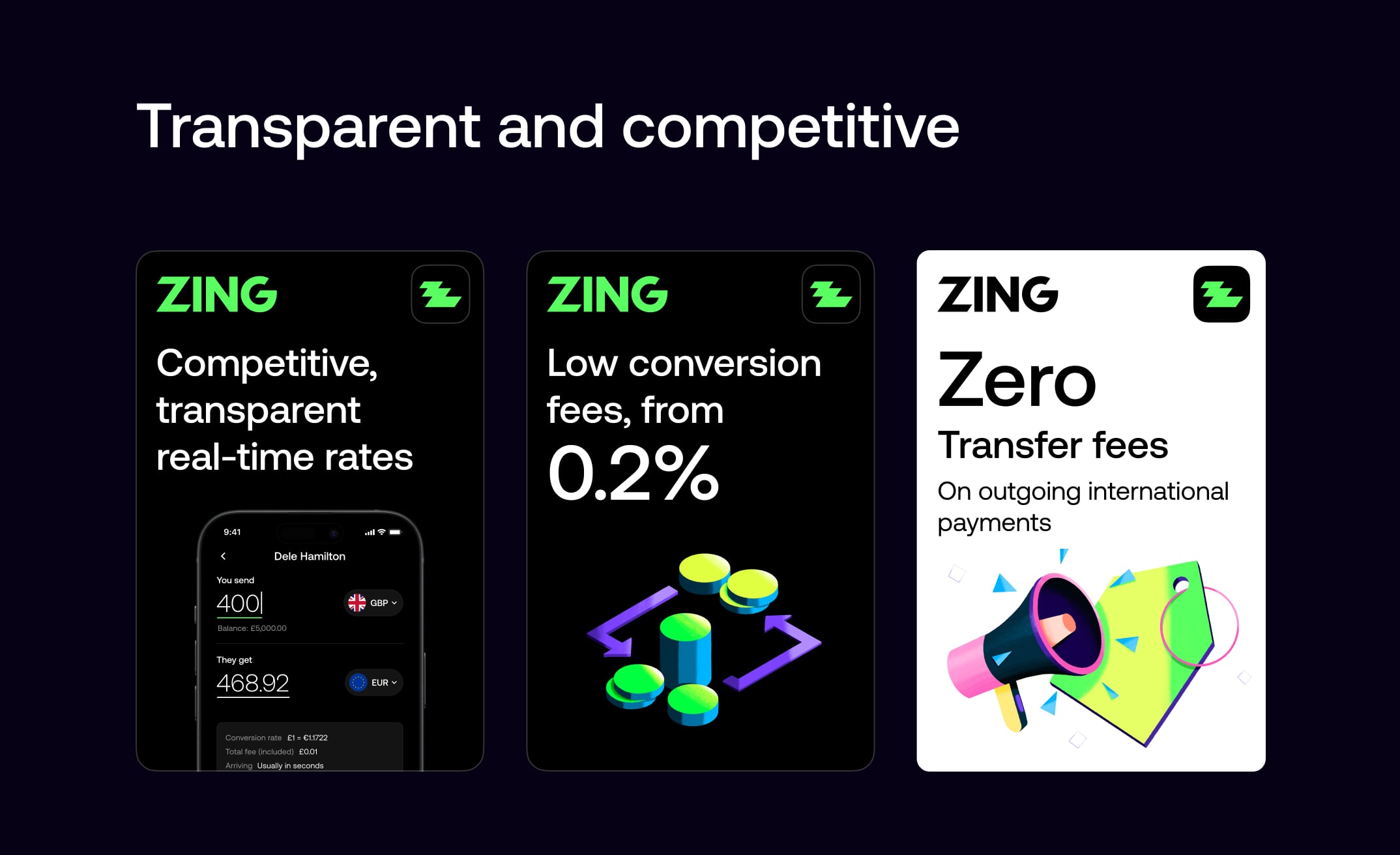
Real-time competitive rates
Transparent fee structure
Significant cost savings
Fast transfer speeds
Competitive comparison tools
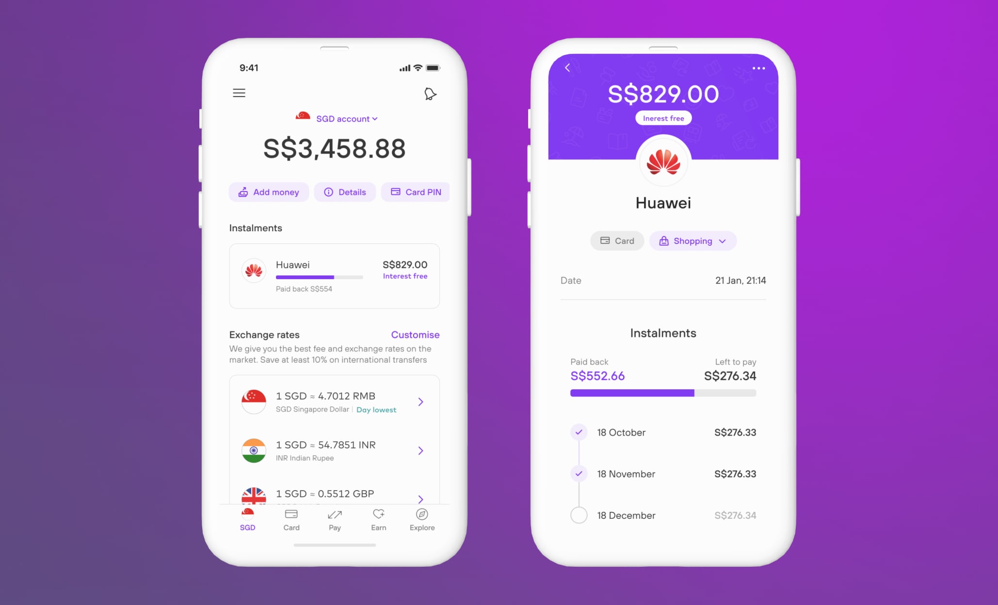
Interest-free instalments
Clear payment schedules
Payment progress tracking
Flexible repayments
Transparent cost breakdown
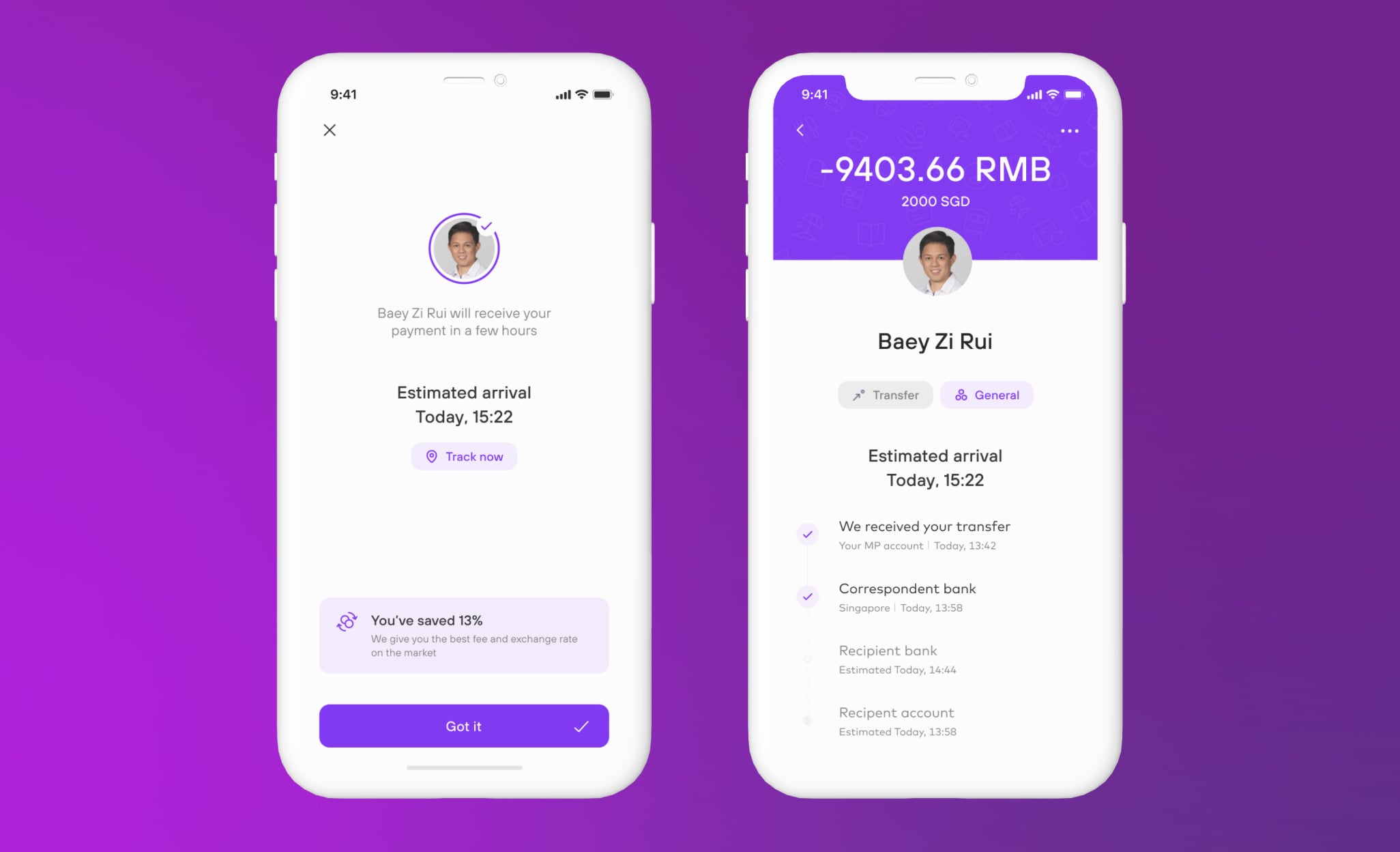
Real-time progress updates
Multi-stage visibility
Estimated arrival times
Estimated savings
Payee and recipient views
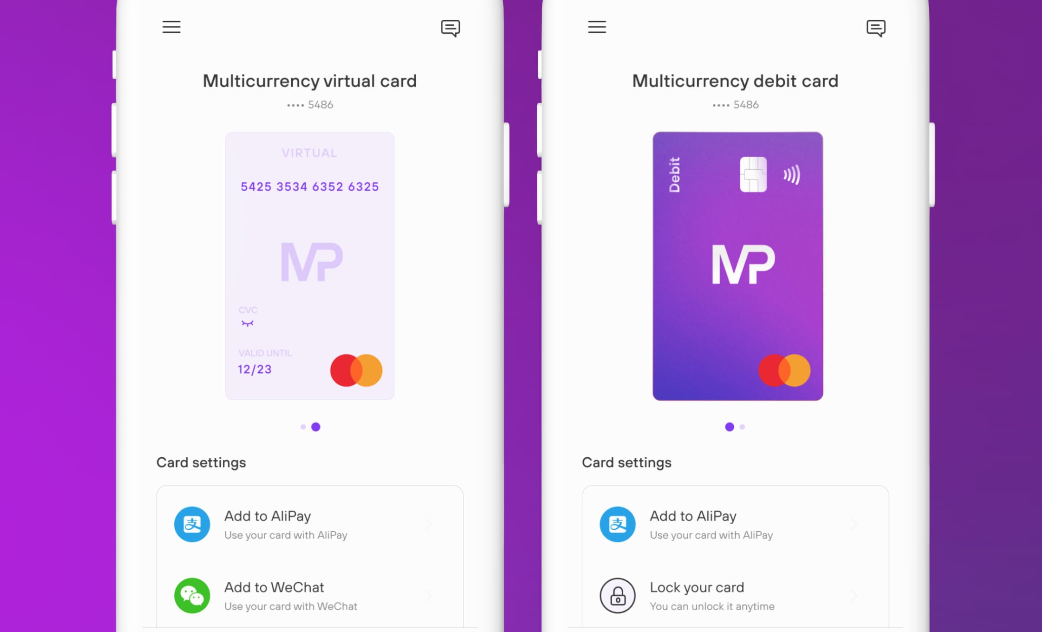
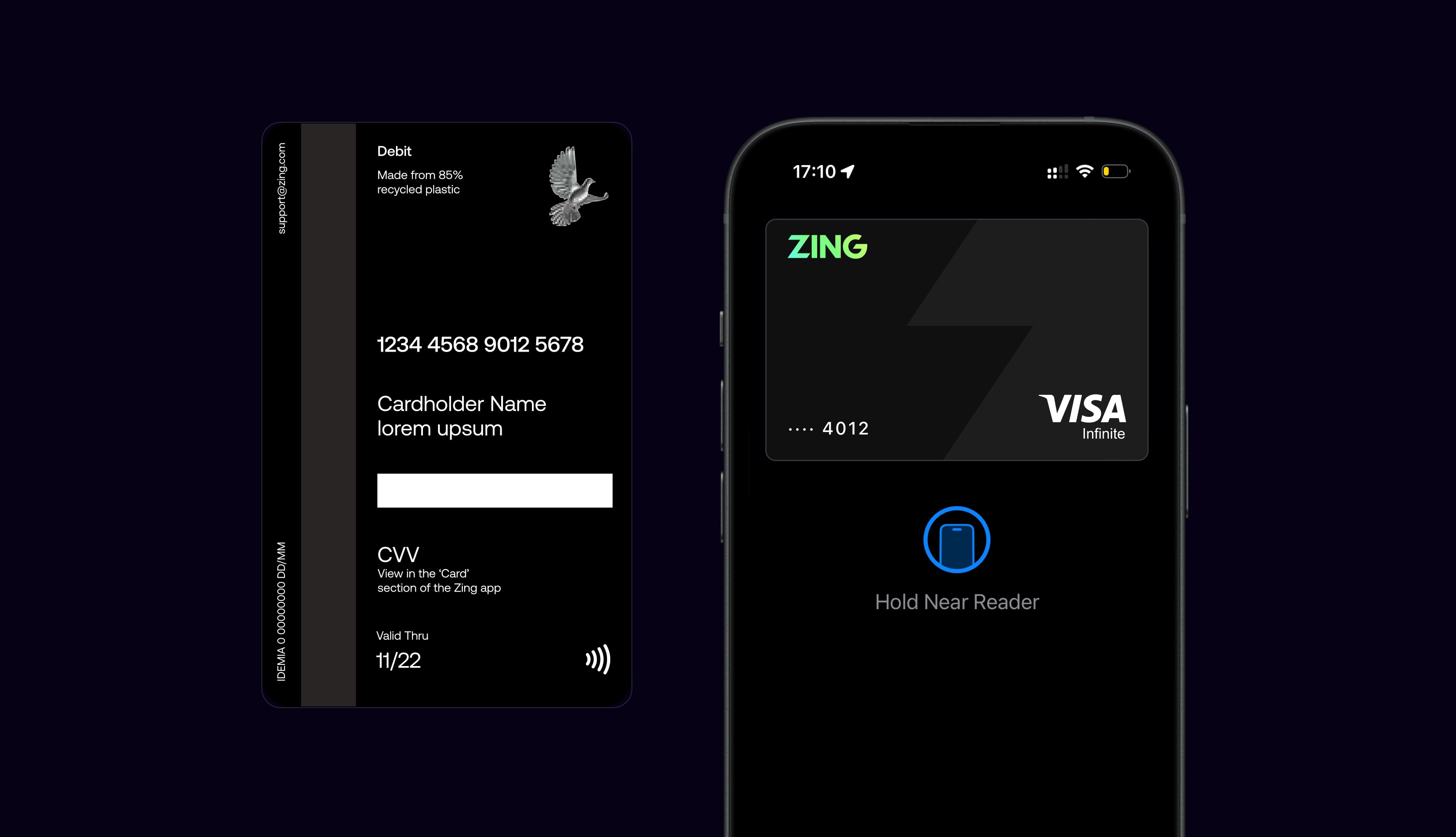
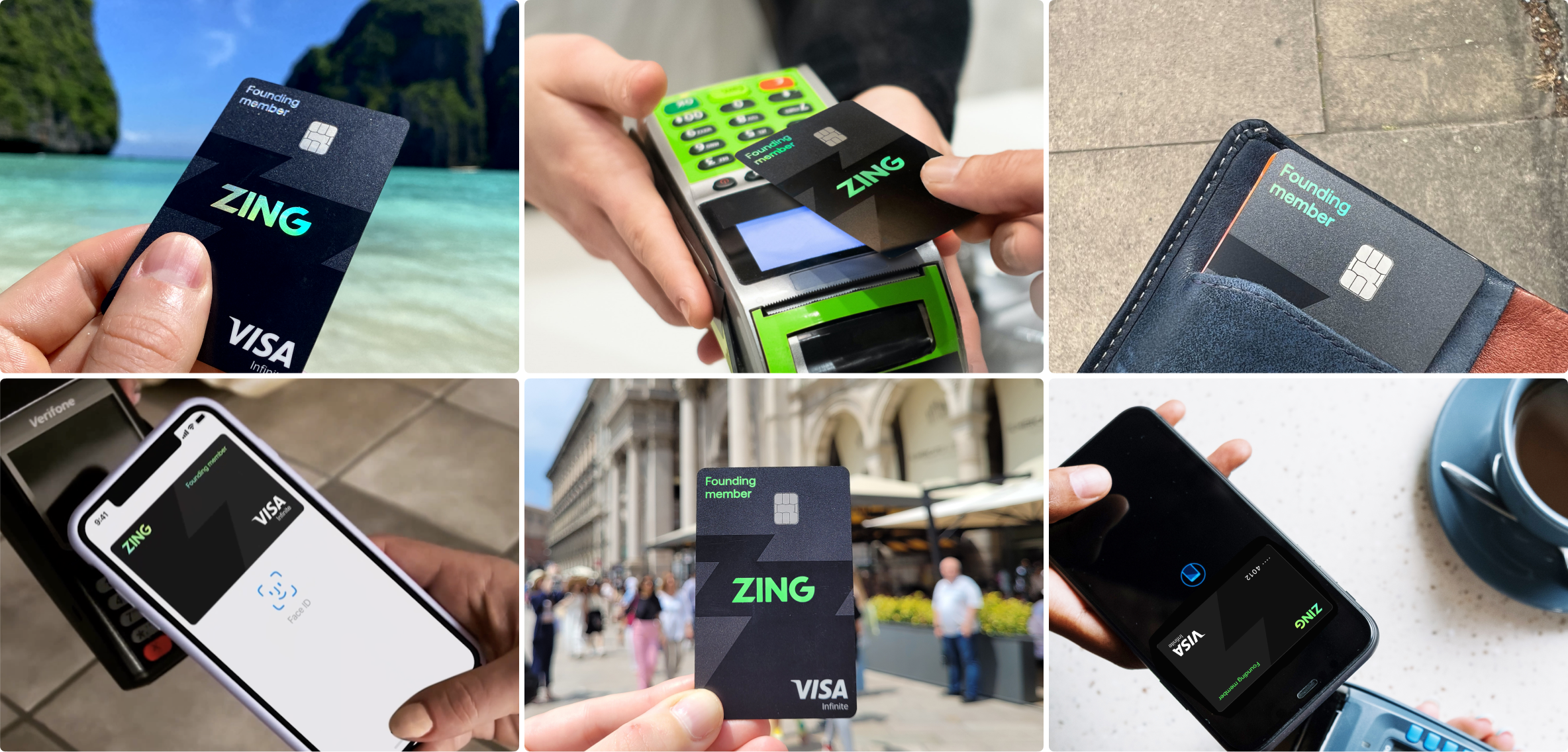
I designed a global multi-currency debit card for seamless payments across currencies with effortless wallet sweeping. Its holographic, edge-to-edge design with a tinted core pushed the limits of card manufacturing, using layered foils and inks to create something truly unique. I worked very closely with our card manufacturers to push hard on what was possible, and achieve a striking result, which that stood out in the market and resonated strongly in early opinion tests.
Virtual and physical cards
Digital wallet integration
Innovative holographic base
Instant card locking
Multi-currency sweeping
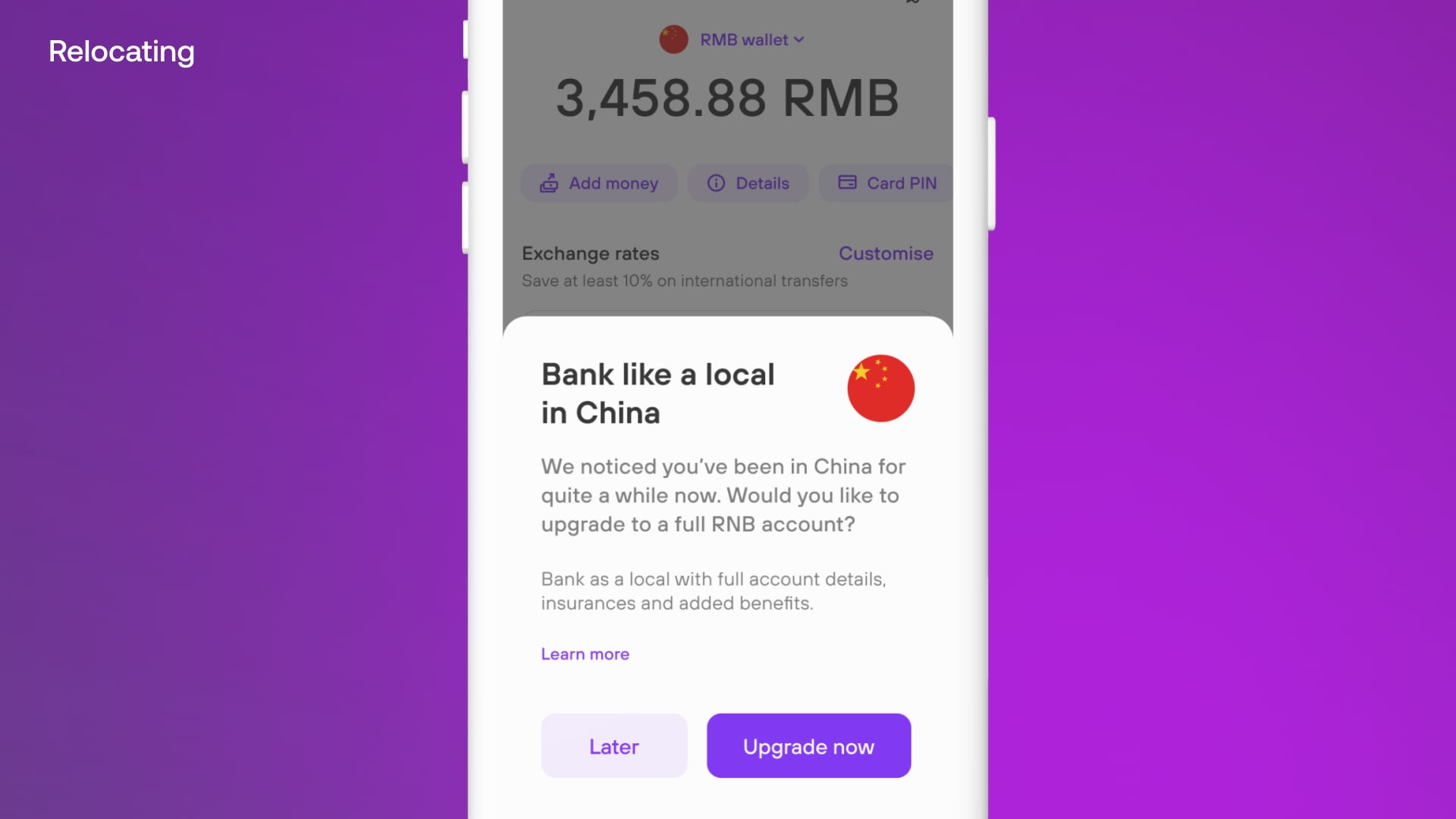
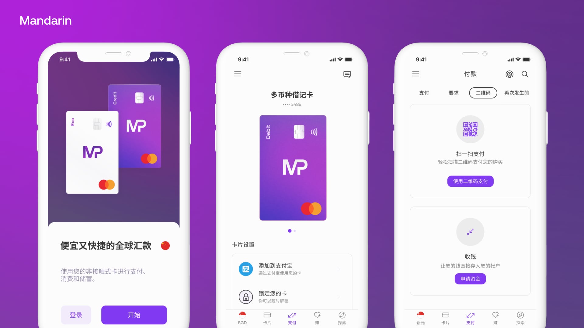
We designed for true global mobility — supporting multiple languages like Hindi and Mandarin, while enabling customers to relocate seamlessly and bank like a local in their new country. Whether moving from Europe to China or traveling abroad, the experience provided transparent foreign currency spending, competitive rates, and clear insights into savings.


With buy-in secured, we moved quickly to design and build an internal proof of concept. Over two months, I led a small team to validate the brand direction, adapt the design system, and demonstrate technical readiness across iOS and Android.
Validate direction
Customising the design system
iOS/Android technical readiness
Automated comms setup
Physical card design printed (without functionality)
Development Alpha
Building the initial product architecture and core user flows.

Once agreements were in place, I led workshops with HSBC leadership to map user needs, define design principles, and deliver a six week proof of concept that secured buy-in. This work established the foundations that guided design decisions moving forward and ensured we were ready to begin shaping the first working product.
Defining our target audience and their needs.
Establishing north stars to guide design and critiques.
Documenting the brand as a living, evolving system.
Setting how we write across phases and communications.
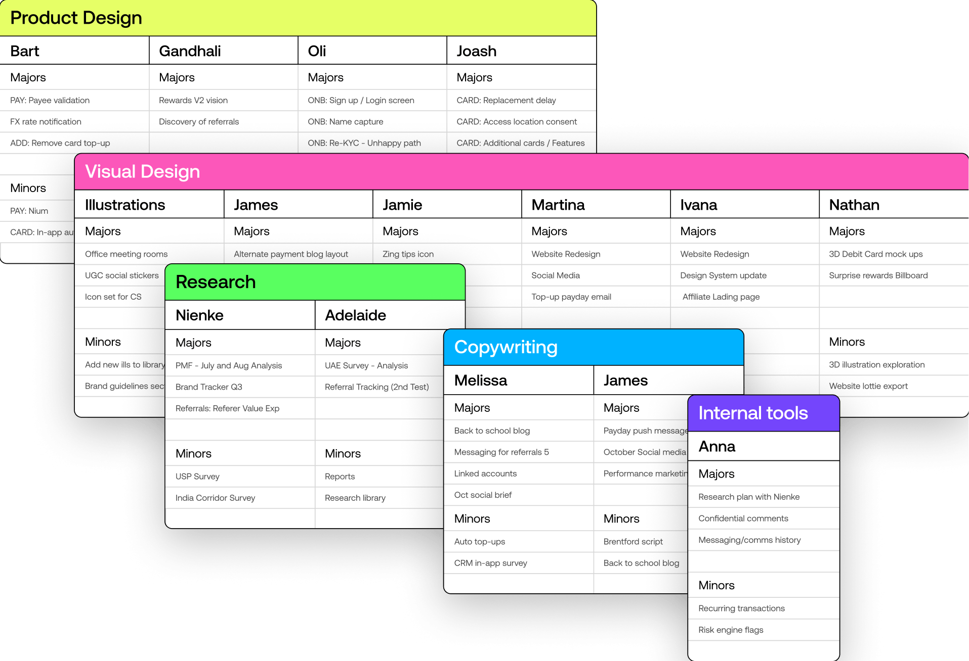
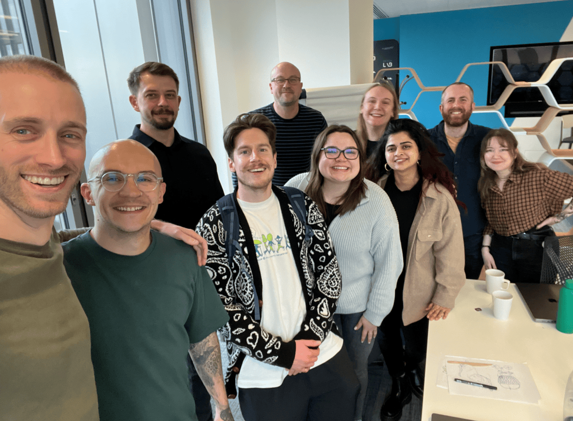
From an initial team of 2 (Me+1), I later hired and assembled a small multidisciplinary team, comprised of all disciplines of Design to lay the foundation for Zing's first version. When building the team, I looked for designers who were generative with ideas, had strong communication skills, demonstrated a strong work ethic, were personable, showed high user empathy, and possessed strong visual and UX craft.
While each designer's day-to-day work varied across different scrums and initiatives, I established a structured weekly rhythm that kept the team tightly together and cohesive. This consistent structure ensured we continually moved forward our strategic design org initiatives, which steadily levelled up the quality of design and UX. The result was a product that always felt like it was designed by the same hand, with the team operating as a consistent, shared knowledge brain despite working across different product areas.
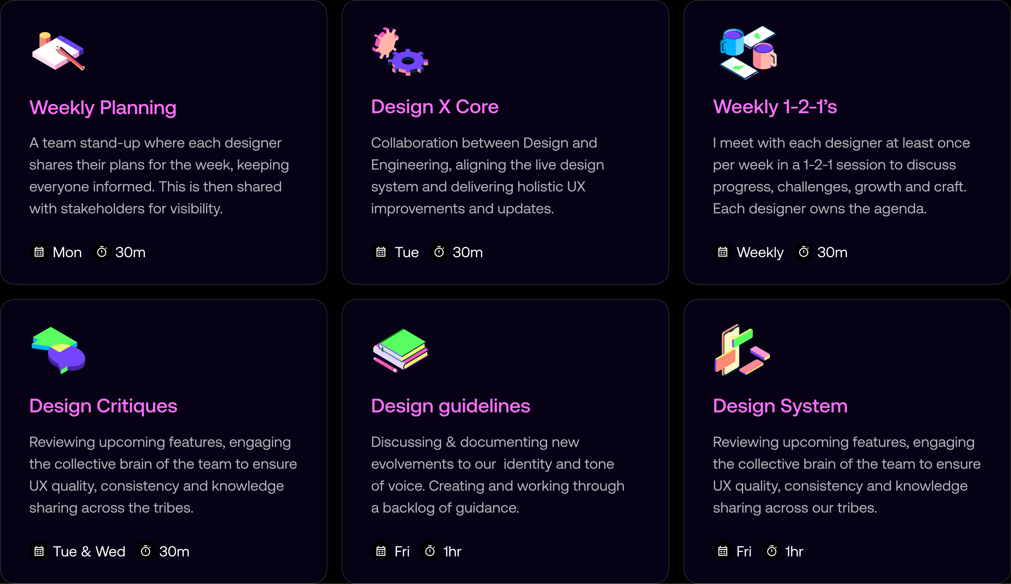
To ensure the design team could work effectively and deliver consistently, I established systems for alignment, visibility, and resource management. These processes enabled us to track initiatives, align with stakeholders on priorities, and balance workloads across the team's capacity.
Each Monday, the design team comes together for a 30-minute stand-up to align on priorities and workloads. Designers share their focus areas and upcoming deliverables, split into Majors and Minor initiatives, providing transparency and fostering collaboration. After the session, I update and share the sheet with stakeholders, providing insight into the team's capacity and helping streamline requests for new initiatives.
We progressed to setting up Asana boards for each key area of design, allowing us to track design initiatives and align with stakeholders on priorities. This structure enabled us to plan initiatives across available design capacity, ensuring we could balance workloads effectively.
We defined a new set of principles: Dynamic, Authentic, Helpful, and Transparent, to guide decisions, align the team, and ensure consistency across every aspect of the product experience.
We used these principles as a framework to discuss and justify design decisions against. They anchored critiques and reviews, helping us clarify trade-offs and make informed choices on key product decisions like onboarding friction and fee transparency. The principles also shaped our visual craft, established a shared language across teams, and helped raise the bar on quality.
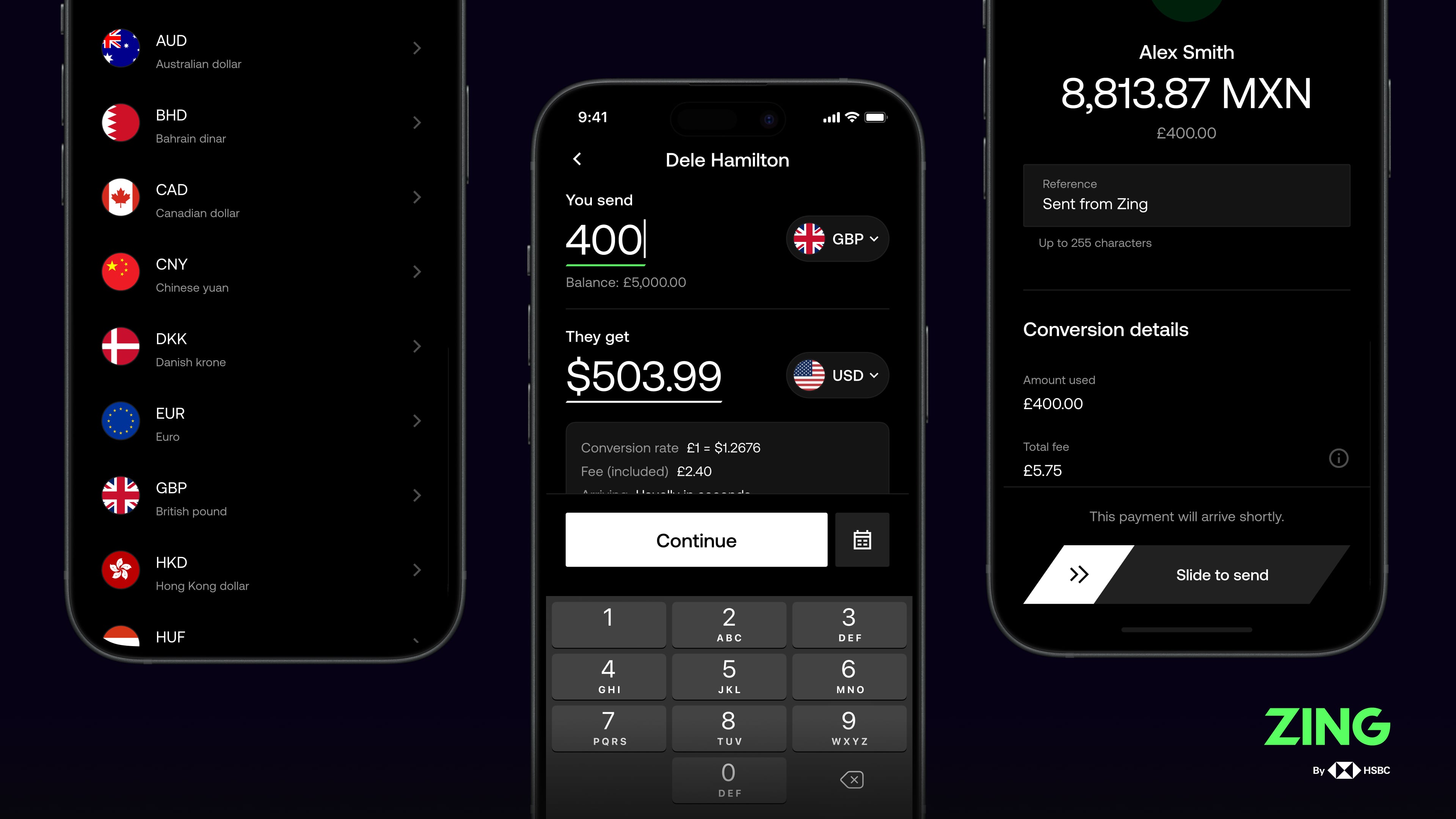
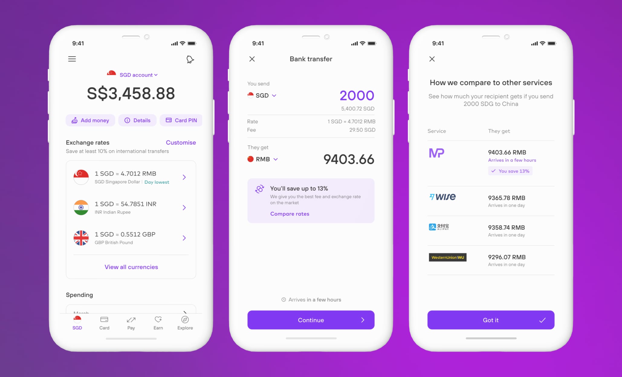
I initially crafted early concepts of our payments experience, focusing on maximizing speed, simplicity, clarity, and ease of use. To ensure customers were clear and intentional when making the final interaction, I introduced and tested a slide-to-pay feature that required deliberate action to complete transfers. As the product evolved, I hired and mentored other product designers who worked on the enriched international payments feature set, scaling the experience while maintaining our core UX principles.
We made fee transparency a core design principle. Customers see exactly what they're paying, with progressive disclosure of conversion rates, transfer fees, and totals at every stage of the journey. By surfacing this information upfront, we built trust and removed uncertainty from international transfers.
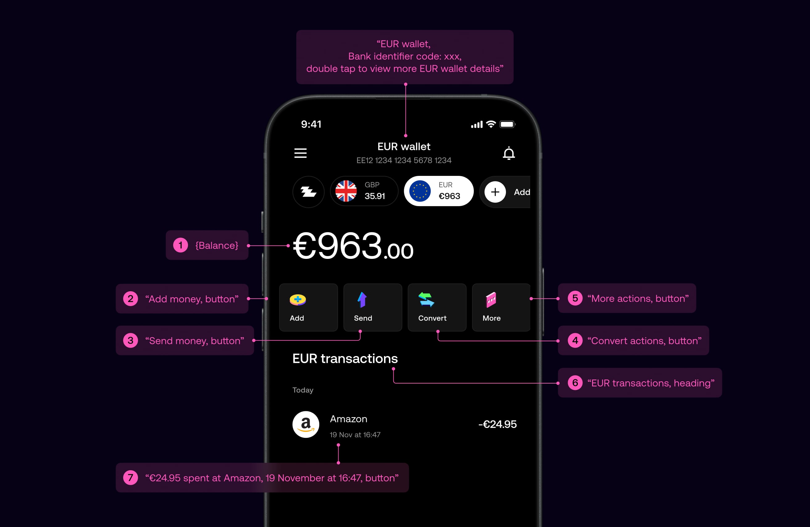
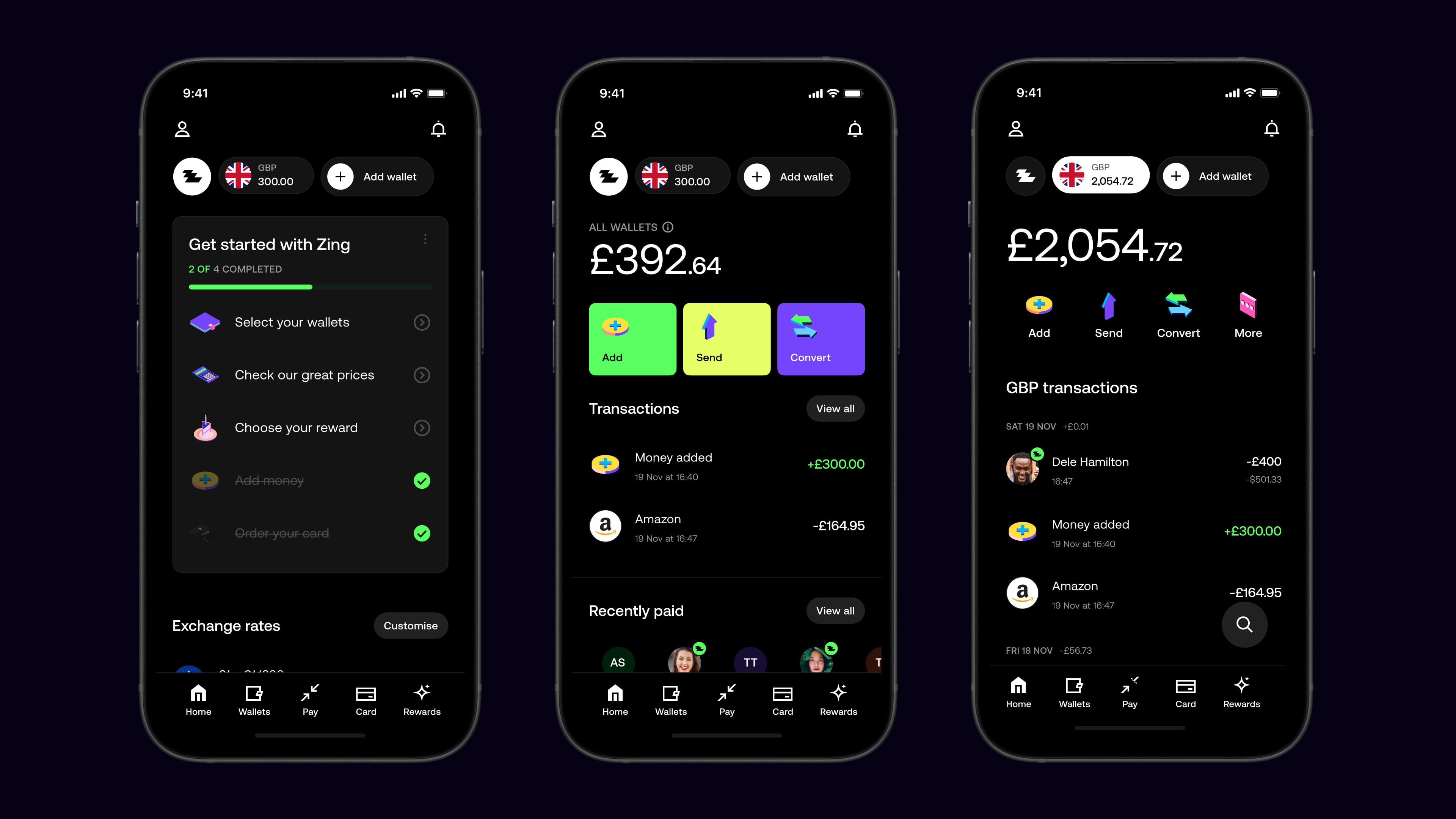
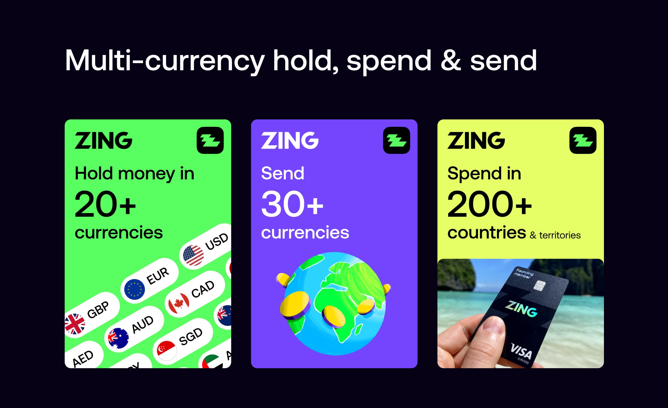
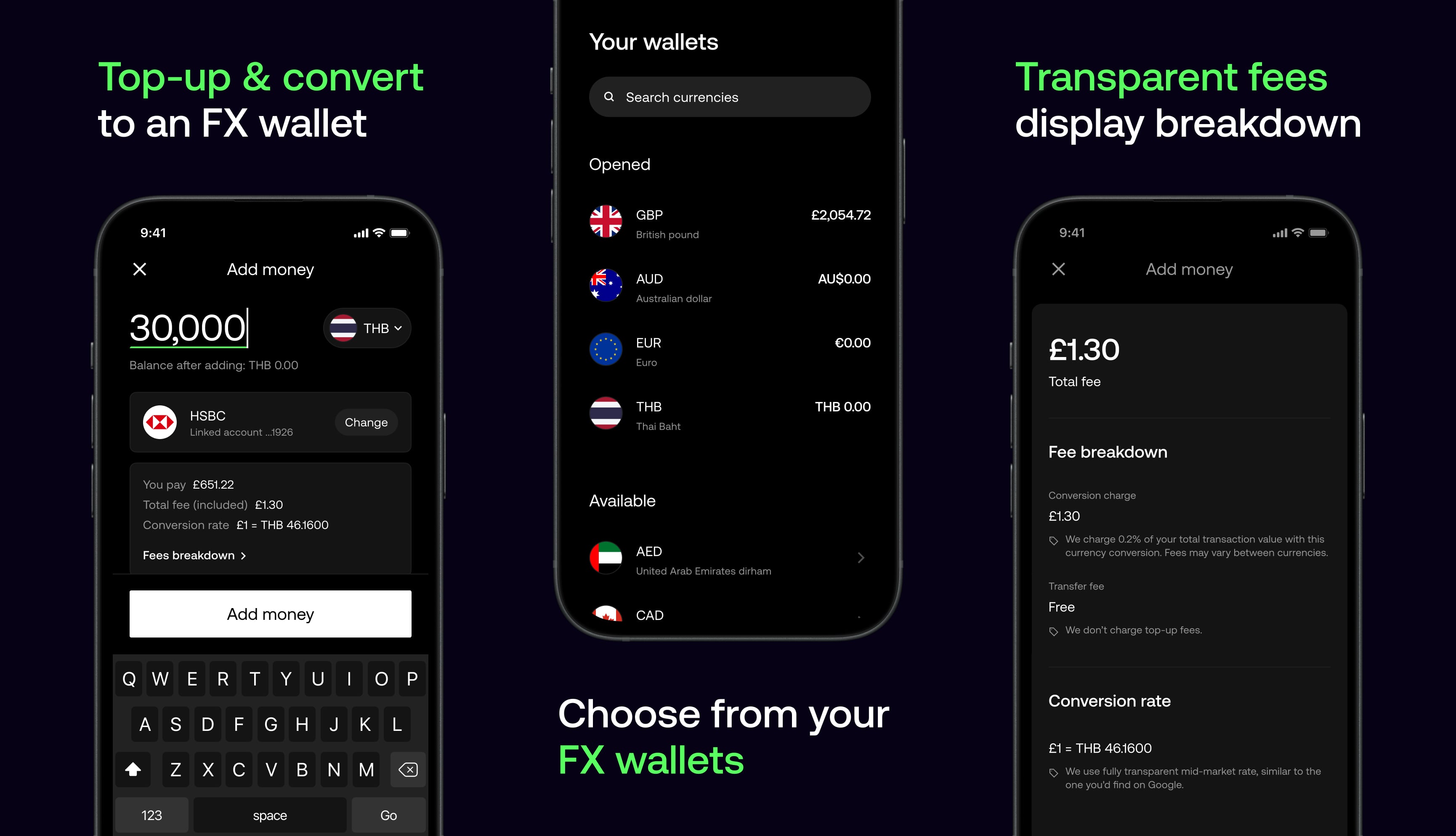
We designed wallets that let customers hold, send, and convert money across currencies with ease — making global payments more transparent, flexible, and convenient.
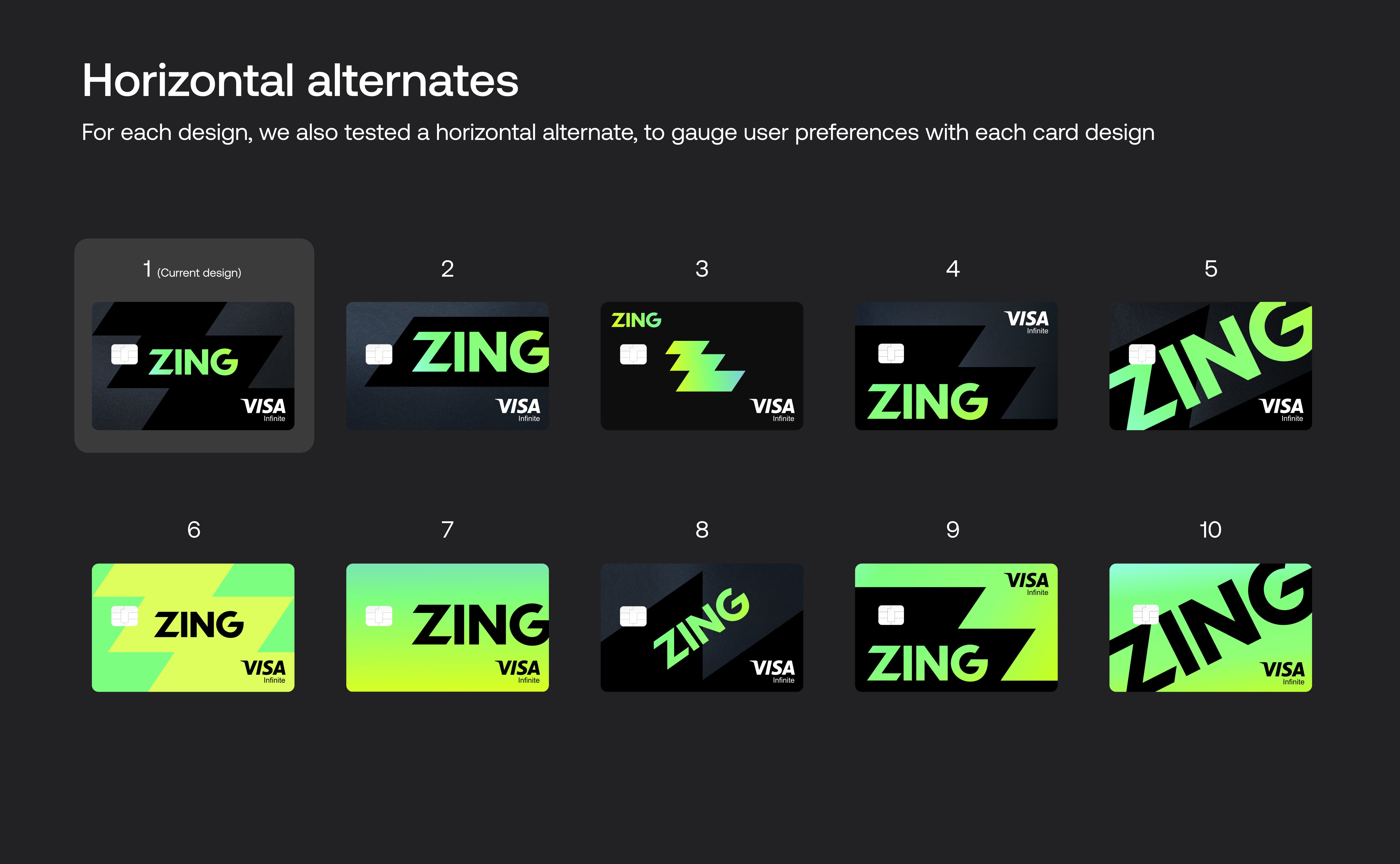
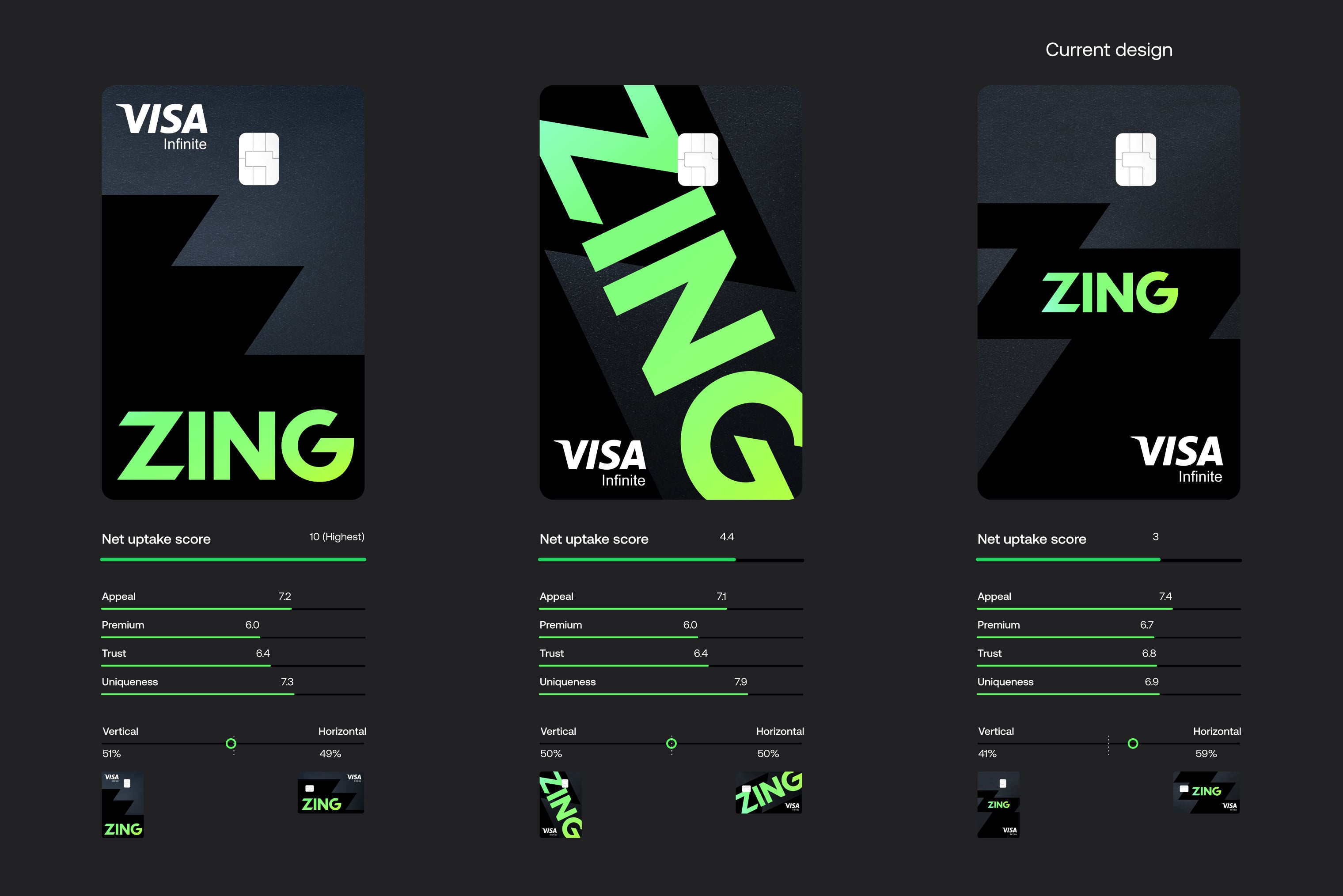
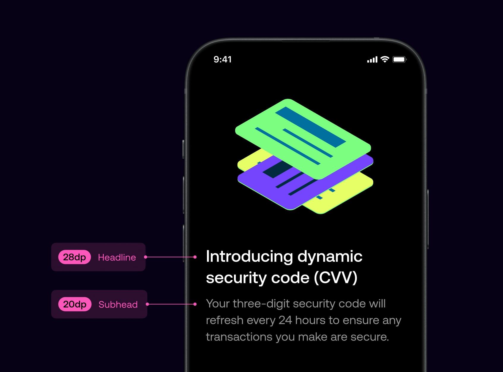
I designed a global multi-currency debit card that pushed the boundaries of card manufacturing. Starting with a wide range of concepts, we narrowed down to 10 final designs tested in both vertical and horizontal orientations. Through quantitative research, I analysed results across key metrics including Appeal, Premium, Trust and Uniqueness, with a focus on frequent travellers.
After presenting the highest performing designs to leadership and gaining budget approval, we moved forward to physical sampling. Working closely with manufacturers, we explored every detail including the holographic logo, pearl base finish, accessibility notch and hidden CVV, where real-world feedback informed our final design.
Holographic logo
Pearl base and metallic sparkles
Hidden CVV for security
85% recycled plastic
Custom vertical layout
Apple and Google Pay
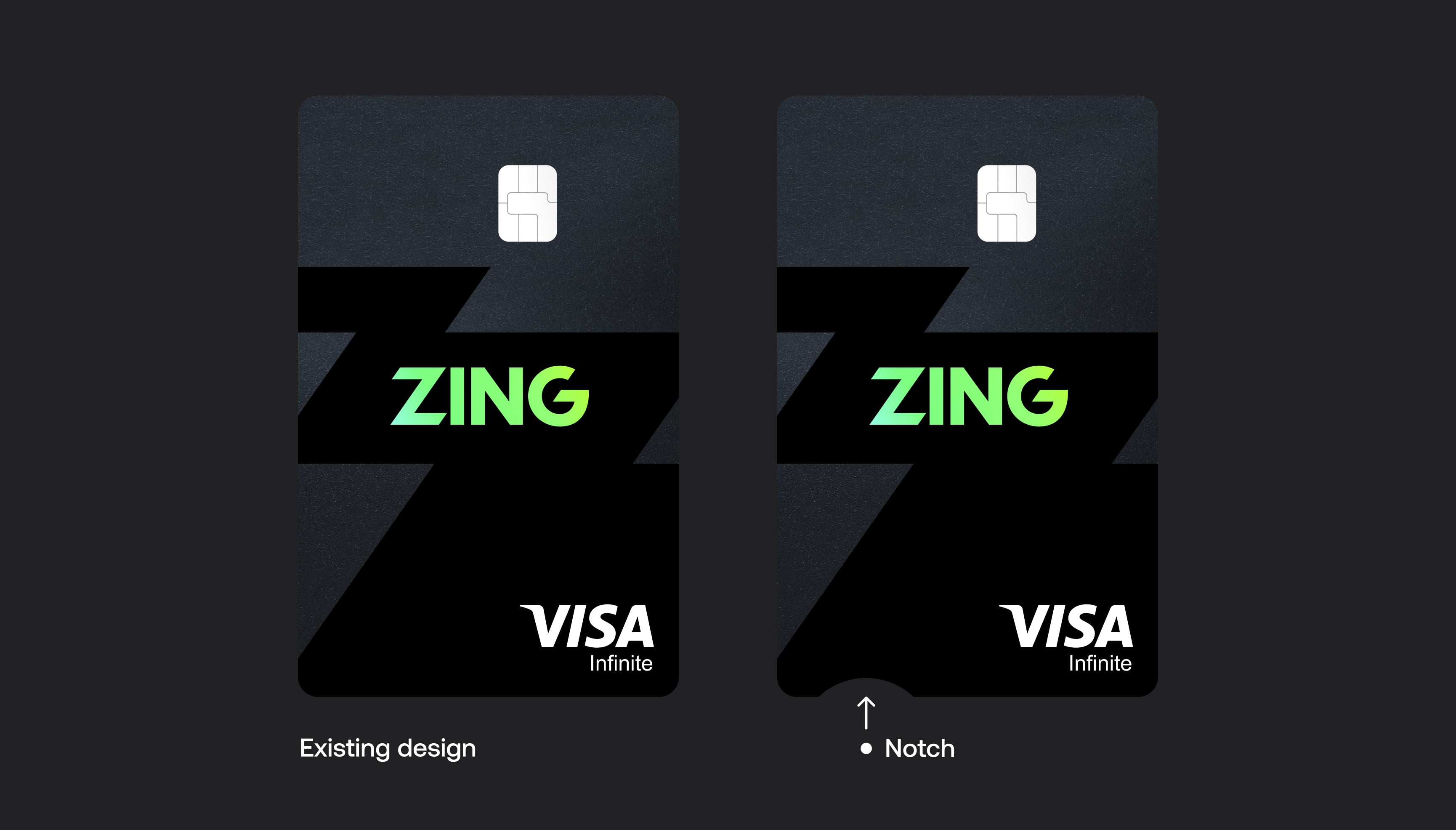
We designed an accessibility notch on the physical card to help users with visual impairments easily orient the card in the right direction. The small semi-circular cut-out on the bottom edge provides a tactile reference point, making it simple to identify which way is up when inserting the card into terminals or ATMs.
I ran a survey across the 10 final designs, each tested in both vertical and horizontal orientations. Personally analysing the quantitative results, I broke the data down by traveller frequency, gender, income brackets, age ranges, and key focus markets to uncover insights that would inform our design decisions.
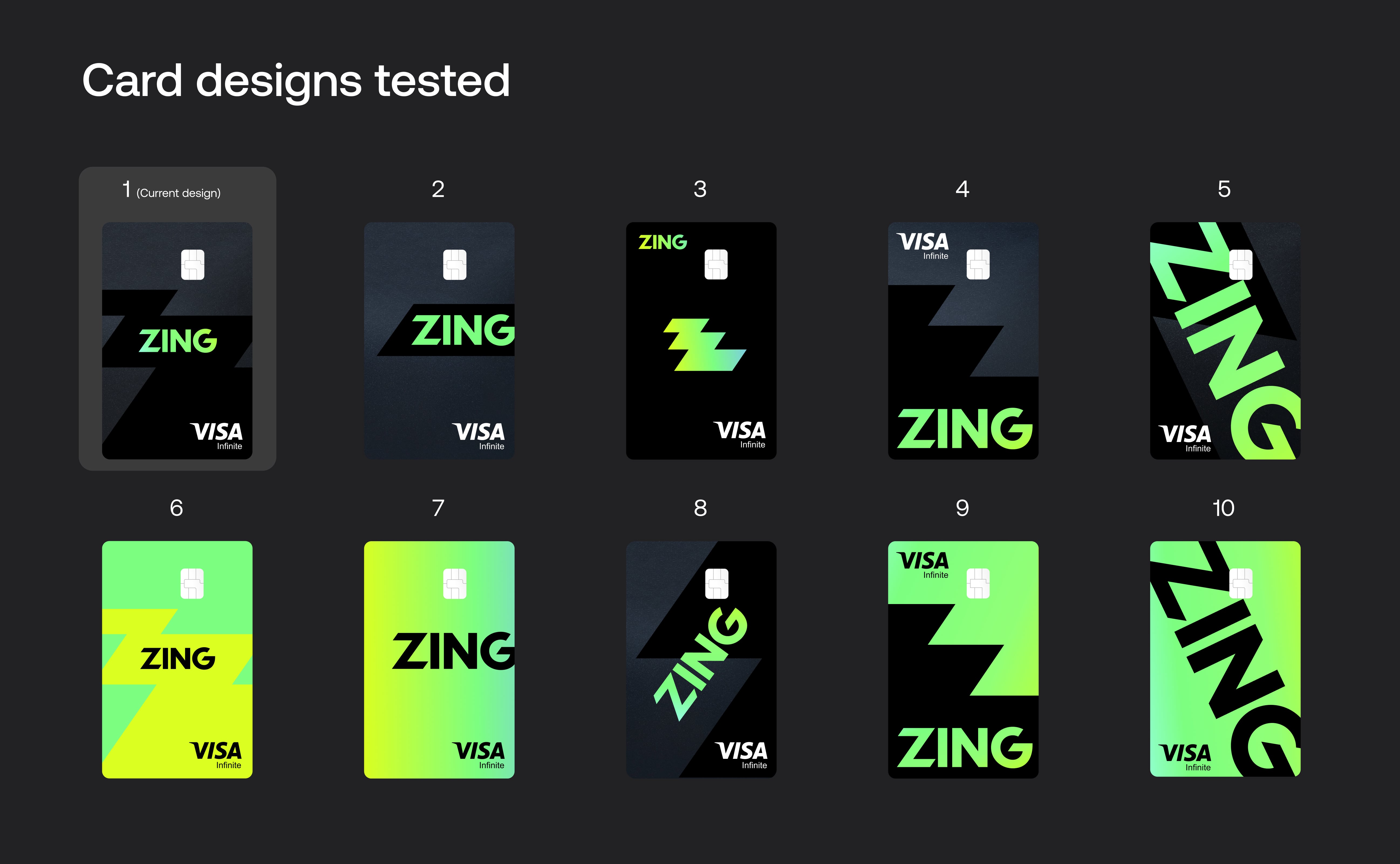
The main metric we tracked was a net uptake score. This was calculated by capturing each user's preferred design and their least preferred design. By deducting the number of times a design was selected as least preferred from the number of times it was selected as favourite, we calculated this metric.
The main user segment we were designing for was the frequent traveller group, for which our chosen card design performed highest. We also considered several other key metrics such as Trust and Premium feel, which are explained in more detail further down.

Beyond net uptake, we tested four additional key metrics: Appeal, Premium, Uniqueness and Trust. These were extremely important factors we were designing for.
Our chosen card design performed highest in Appeal and Trust, and a close second on Premium feel. The chosen card was lower on Uniqueness, so we monitored other designs closely which scored highly in this area and moved these on to physical testing stages too.

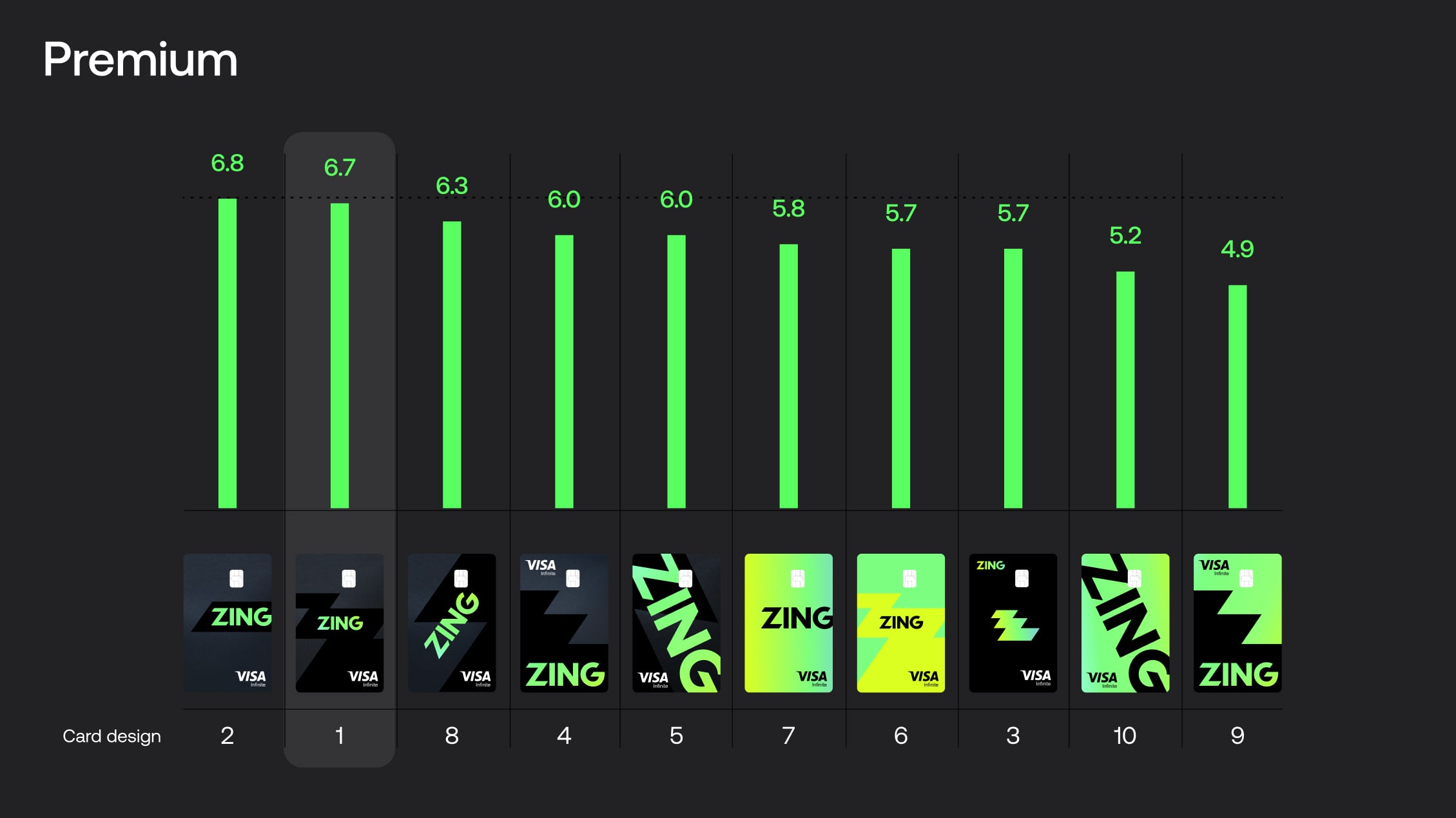


The card we had chosen to go forward with, while it didn't test highest on the overall net uptake score, it tested highest on our main key metrics of Appeal, Premium and Trust. We chose to move the other highest performing cards on to physical card testing too, to investigate those further in real life.
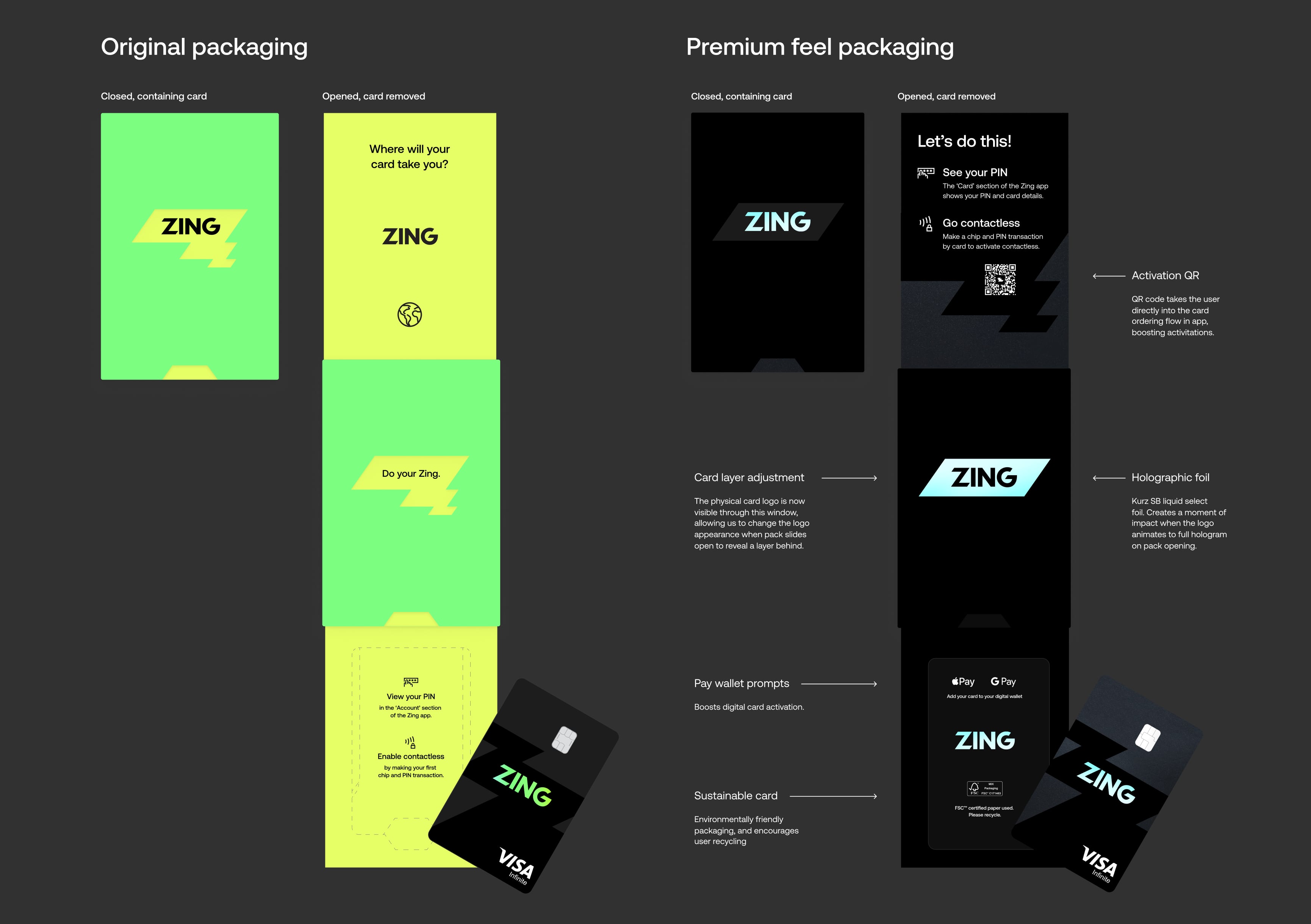
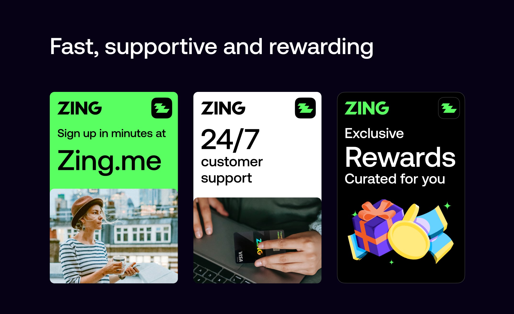
I personally designed the debit card packaging, looking to create an impactful unboxing experience that feels unique, differentiated, and memorable for customers. The goal was to craft an experience so impactful that customers would enjoy it and share it with friends.
I worked closely with our packaging manufacturer to push the limits of what was possible with the packaging, creating a unique branded experience with diecuts of the logo to reveal brand messaging that animates through the window as the pack is opened, revealing setup instructions and the debit card popping out into the customer's view. This exciting reveal creates a moment of delight, and customers frequently left reviews expressing their delight with this experience and the card and package unboxing experience overall.

"Hands down the nicest experience getting a new card, ever. Didn't expect the packaging to slide out like it did, super nice touch."
"Card came in really cool packaging."
"Finally got around to applying for a Zing card. Application all through the app and completed within a few minutes, card available in mobile wallet straight away and then this impressive package a few days later."
Following customer feedback highlighting visual inconsistency between the packaging colour and the card itself, I explored an optimisation of the packaging to optimise more heavily for a premium feel. I chose a special soft touch board, exploring an environmentally friendly option that allowed us to display the FSC logo, and also included a QR code activation helping to boost card activity rates. This pack felt a lot more consistent with the card's design, and more sleek overall. I also simplified the diecut slightly to avoid some creasing from delivery which customers were reporting when the card arrived.
I positioned the layer which the card was on to be a layer above so the card's holographic logo is directly showing through the diecut area. This helped ensure consistency of the look, and also increase the impact of the reveal when the customer realises that the packaging is actually displaying the card. Then showing a full hologram flood when the pack is fully opened, helping to dial up the impact as the customer sees a holographic flash reveal. I also added the payment wallet instructions and logos helping to boost digital wallet activation.

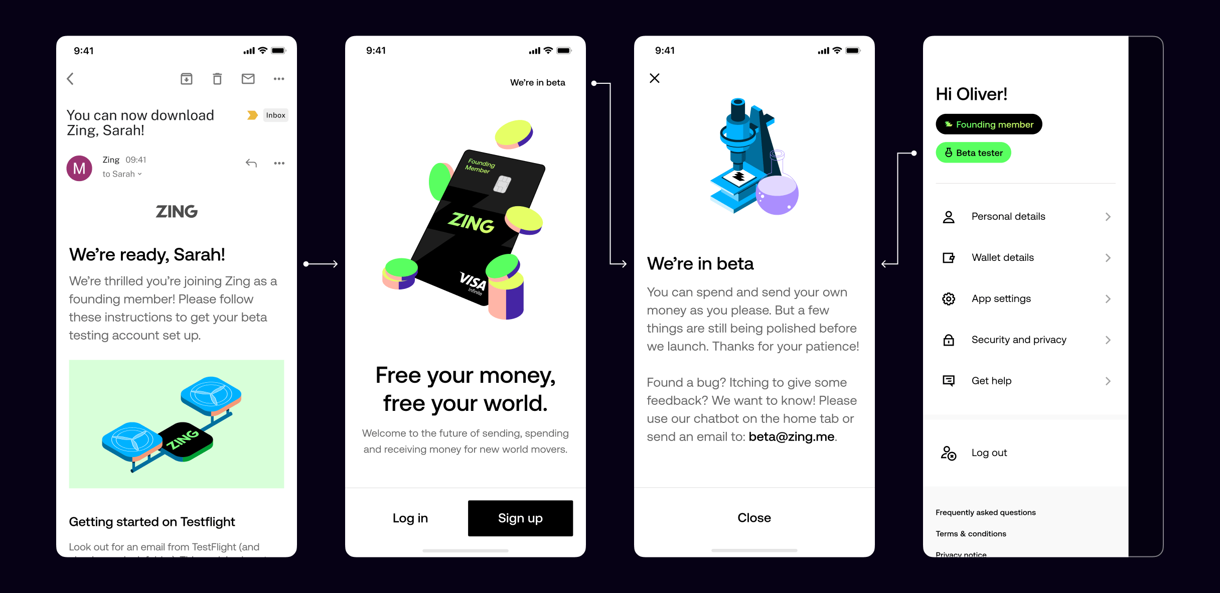
Private Beta
Testing core functionality with internal users and refining the experience.

With our MVP ready, we launched a closed beta exclusively for HSBC staff through iOS TestFlight and Google Play Beta. This critical validation phase allowed us to test real user behavior, refine core flows, and gather actionable insights before scaling to a broader audience.
Distributed exclusively to HSBC staff via iOS TestFlight and Google Play Beta with limited card availability.
Refined core user journeys including onboarding, money management, transfers, and currency conversion.
Collected behavioral insights from real HSBC staff usage patterns and prioritized improvements based on user needs.
Navigated technical constraints and regulatory requirements while maintaining product integrity.
With our MVP ready, we launched a closed beta exclusively for HSBC staff through iOS TestFlight and Google Play Beta. This critical validation phase allowed us to test real user behavior, refine core flows, and gather actionable insights before scaling to a broader audience.
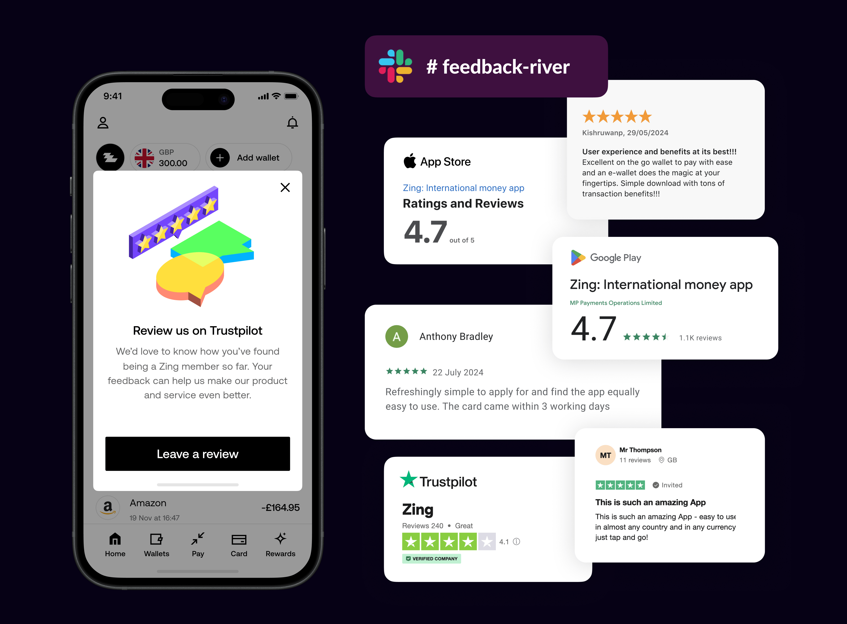
We set up a dedicated feedback river Slack channel that automatically collected all customer feedback in real-time. This continuous stream of insights helped us understand user needs, identify pain points, and iterate quickly on our product features.
Real-time feedback aggregation
Automated Slack channel integration
Continuous user insights
Rapid iteration cycles
Data-driven product decisions
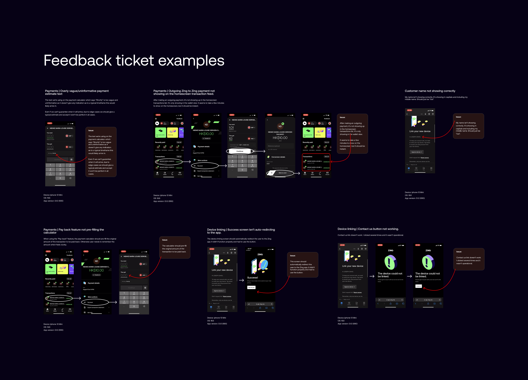
Encouraged rigorous app testing
Visual documentation of issues
Continuous improvement tracking
Direct developer communication
Figma-based issue reporting
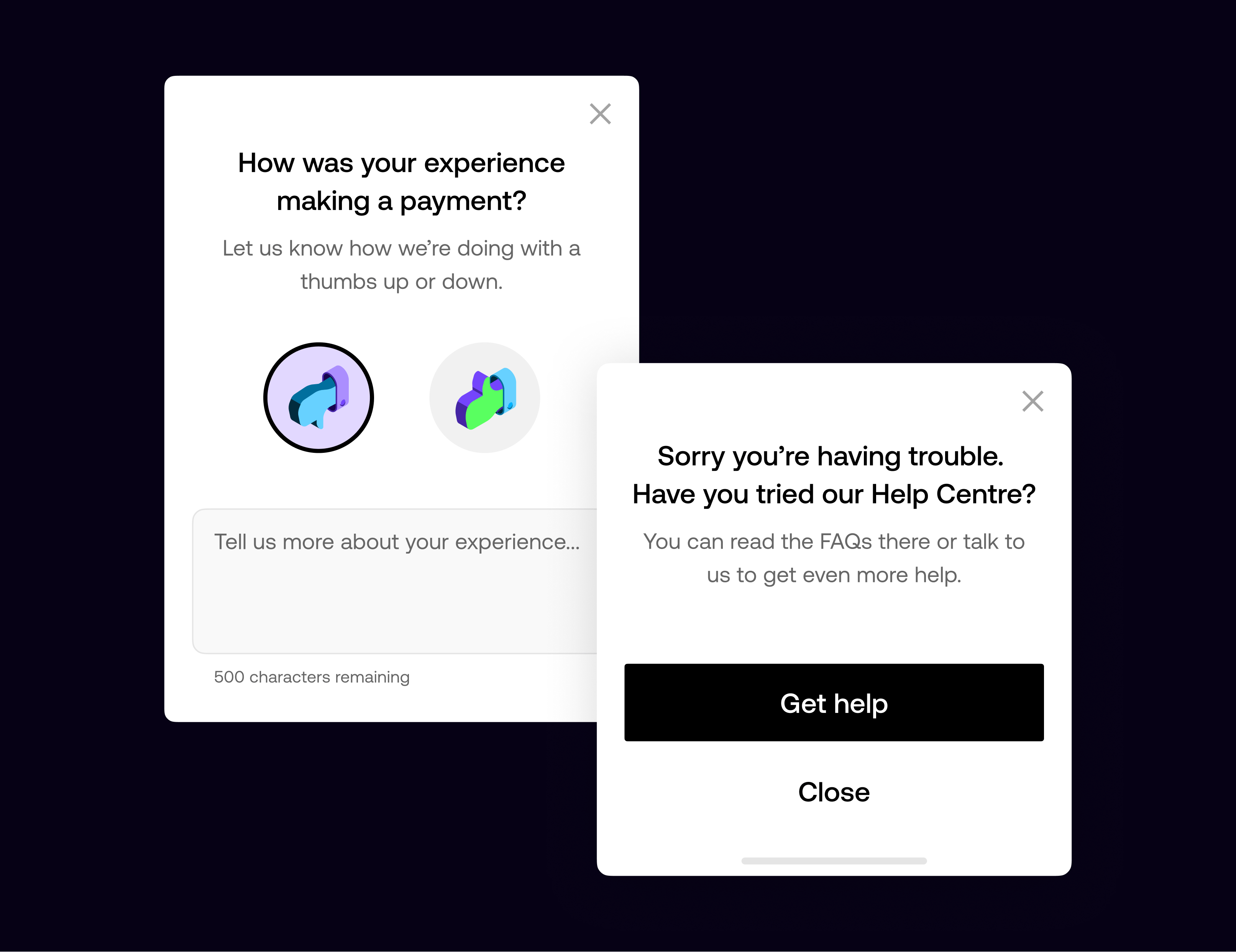
Braze-driven feedback prompts
Post-journey experience rating
Real-time sentiment monitoring
Immediate help centre access
CRM team collaboration
I led the visual direction for our icon and illustration systems, setting a unified style that reflected our angular brand elements and supported both product clarity and brand expression.
After presenting the highest performing designs to leadership and gaining budget approval, we moved forward to physical sampling. Working closely with manufacturers, we explored every detail including the holographic logo, pearl base finish, accessibility notch and hidden CVV, where real-world feedback informed our final design.
We defined the structure and visual rules for our icon set, using our signature 35 degree angles to keep everything aligned with the core brand geometry. The icons were designed to stay clear and functional in mobile UI views, expanding gradually as the product grew while maintaining a consistent, readable style.
I led the visual direction for our illustration system, shaping an isometric style that became the foundation for both product and marketing work. I partnered with an illustrator who created the initial set and expanded it as the app matured, developing product scenes, more textured marketing visuals, and a sticker style for use on complex backgrounds.
I worked with our illustrator and animator to bring the system to life with subtle motion that supported the user journey. These animations helped soften moments like onboarding and KYC checks, and guided users when their flow shifted or extra steps were needed. The movement stayed light and purposeful to draw attention to key messages without adding noise.
I worked very closely with the CRM manager and creative strategist who reported into me, and we set up our customer messaging systems across push messages, SMS, emails, and in-app messages. We documented carefully all the messages, and maintained a global set of automated comms in Figma, with linked references of all the individual string names, dynamic content database field references, and notes as to exactly which backend service was responsible, or whether the message was sent from Braze.
We created and maintained hundreds of messages across these channels, keeping tone of voice and content rules all consistent and aligned with the brand rules we had set and continued to update. This central library served as a powerful tool to ensure all our messaging was documented and maintained, and didn't just sit in backend systems without visibility.

I created templates and guides for the team, establishing rules for how the email system was structured. These templates served marketing and service messaging, with different options for varying levels of information and action across the customer journey.

Public Beta
Expanding to external users and gathering real-world feedback.
After validating our product with HSBC staff, we expanded to a public beta, opening access to external users through iOS TestFlight and Google Play Beta. This phase focused on scaling our user base, gathering real-world feedback from diverse users, and refining the product experience based on actual usage patterns before our full public launch.
Distributed via iOS TestFlight & Google Beta. Limited card availability.
Refined onboarding, add money, send, and convert flows. Tested early design system components.
Gathered insights from HSBC staff usage. Logged and prioritised bugs for iteration.
Navigated technical constraints and regulatory requirements while maintaining product integrity.
Building on our initial validation, we expanded our beta testing to include friends and family networks. This broader testing phase allowed us to gather diverse user feedback, test scalability, and refine our product-market fit before the public launch.
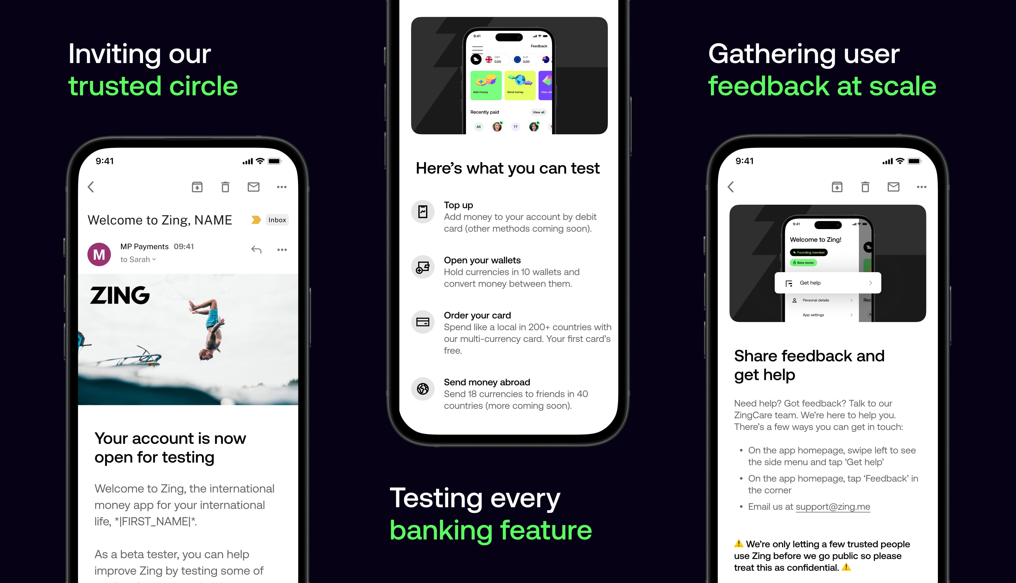
Building on our initial validation, we expanded our beta testing to include friends and family networks. This broader testing phase allowed us to gather diverse user feedback, test scalability, and refine our product-market fit before the public launch.
While accessibility was considered from the outset, we wanted a clear and honest view of where the product stood against AA standards. We began with an accessibility audit across Android and iOS, which showed that most core visual and interaction foundations were in place, putting the product at roughly 65 percent readiness.
The main gaps were in screen reader support, particularly voice-over order and scripting, requiring deeper design and engineering work. I then led the effort to systematically close these gaps with the design team and managed delivery with a core group of engineers.
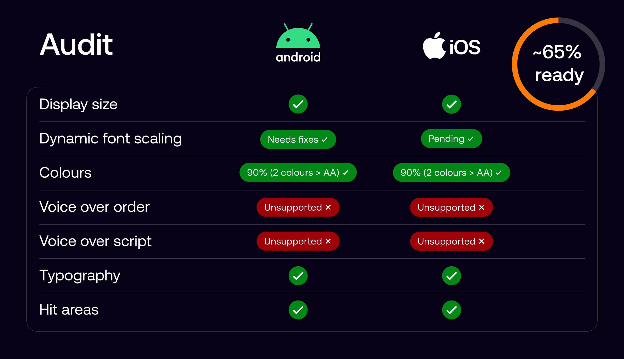
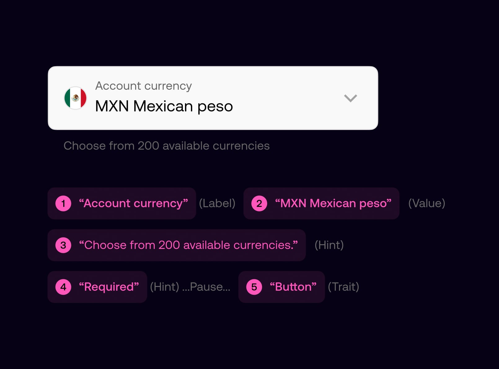
We defined voice-over behaviour for key screens by specifying reading order, grouping, labels, and interaction cues, and carried this through to handoff as part of standard design documentation.
This ensured the spoken experience aligned with the visual hierarchy and user intent, giving screen reader users a predictable and usable journey, while providing engineers with clear, implementable guidance.
All components in the design system were defined with consistent accessibility semantics, including labels, roles, and reading order. This enabled designers to assemble screens confidently, knowing components would be read correctly by screen readers by default.
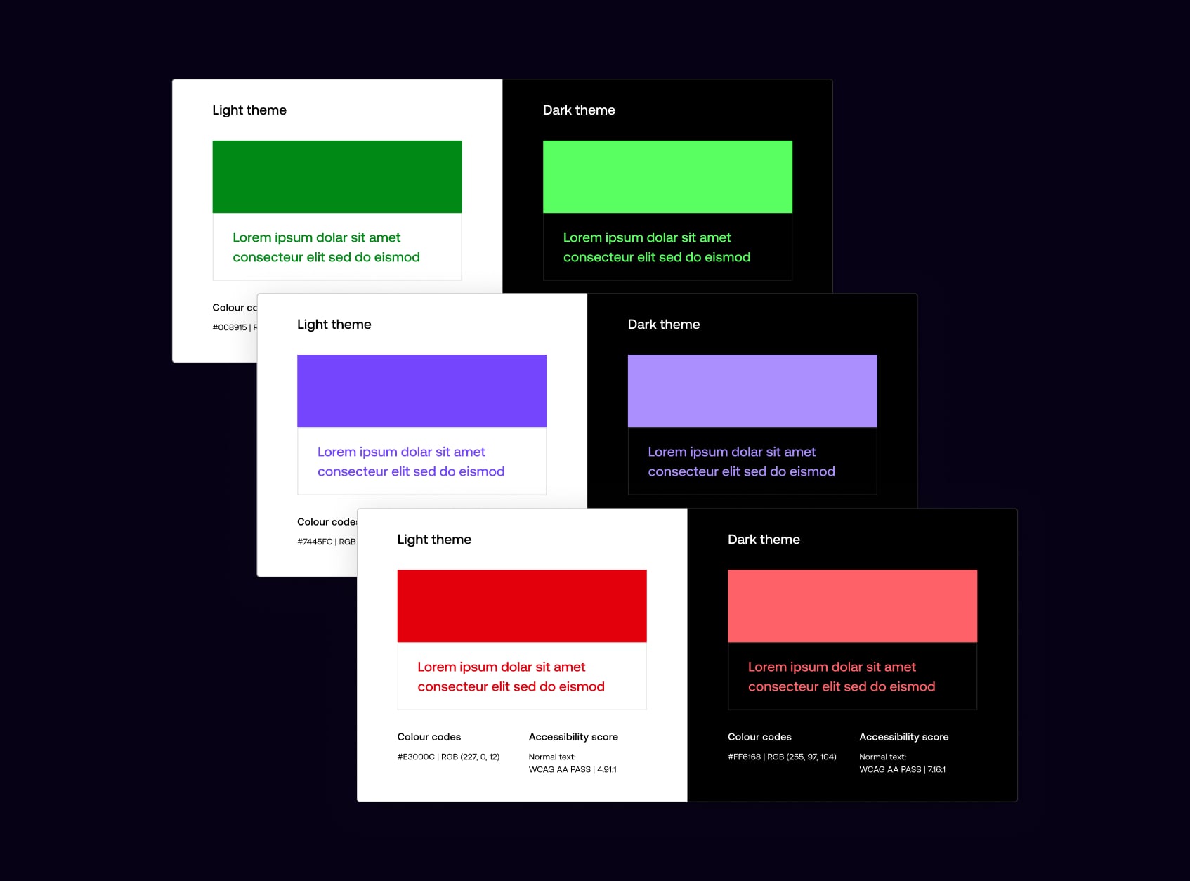
We reviewed colour contrast across light and dark themes to ensure every token met WCAG AA standards, refining the colour system, resolving edge cases, and ensuring consistent contrast across the product.

Light and dark themes were reviewed independently, with colour tokens adjusted to ensure legibility across backgrounds, states, and components, while preserving visual balance in each theme.
Navigation was designed to be simple, predictable, and easy to understand across the product. We focused on clear hierarchy, familiar patterns, and supportive copy to help users move confidently through key journeys, reducing cognitive load and minimising the risk of error, particularly in sensitive or high-impact flows.
All interactive elements were designed with generous tap targets and sufficient spacing to support accuracy and ease of use. Buttons and links meet minimum size guidelines, with clear visual affordances to indicate interactivity. This improves usability for all users, while particularly supporting those with motor impairments or reduced dexterity.

Journeys were structured using consistent layouts and language, with clear intent communicated at each step. Destructive or irreversible actions are protected by confirmation dialogues, ensuring users understand the outcome before proceeding. This approach balances efficiency with reassurance, helping users navigate confidently without accidental actions.
Typography was designed to create clear hierarchy and maintain legibility across all screens. We established consistent type scales, spacing, and content structure so users can easily scan, understand, and act on information, regardless of context or screen size.
We established clear relationships between headings, subheadings, and body copy to guide attention. A highly legible variable typeface supports a wide range of sizes and weights, maintaining clarity when scaled and preserving visual balance and readability across the product.
The app supports dynamic font scaling on both iOS and Android, allowing text to scale with system settings. Layouts were designed and tested across multiple size ranges to maintain hierarchy, prevent clipping, and preserve usability, even at larger accessibility sizes.
We established clear relationships between headings, subheadings, and body copy to guide attention. A highly legible variable typeface supports a wide range of sizes and weights, maintaining clarity when scaled and preserving visual balance and readability across the product.

I led accessibility delivery by creating a single, shared backlog of design and engineering work in Figma across iOS and Android. This clarified priorities and made progress easy to track.
Working closely with designers and engineers, we reviewed and progressed items on a weekly cadence, ensuring accessibility improvements were consistently designed, built, and delivered.

Public Launch
Launching the product to the public with full feature set.

On January 3rd, 2024, we launched Zing publicly in the UK, marking HSBC's entry into the fintech challenger space. The launch required close coordination across product, design, marketing, and PR to ensure a smooth debut. After launch, we focused on stabilising the product, gathering live feedback, and iterating quickly to prove product-market fit and drive adoption.
Launched Zing publicly in the UK on January 3rd, 2024, marking HSBC's entry into the fintech challenger space.
Focused on stabilising the product post-launch, ensuring reliability and smooth user experience across all features.
Gathered real-time feedback from live users to identify issues, prioritize improvements, and iterate quickly.
Drove adoption through coordinated marketing and PR efforts, proving product-market fit and building user base.

After the initial launch, we continued to refine the product based on customer feedback. This included adding more detailed transaction histories, improving error messages, and ensuring a smooth onboarding process. We also focused on building trust with customers by providing clear explanations of fees and ensuring a seamless user experience.
As the product grew, so did the team. We added more designers, researchers, and developers to the team to help us build the product faster and better.
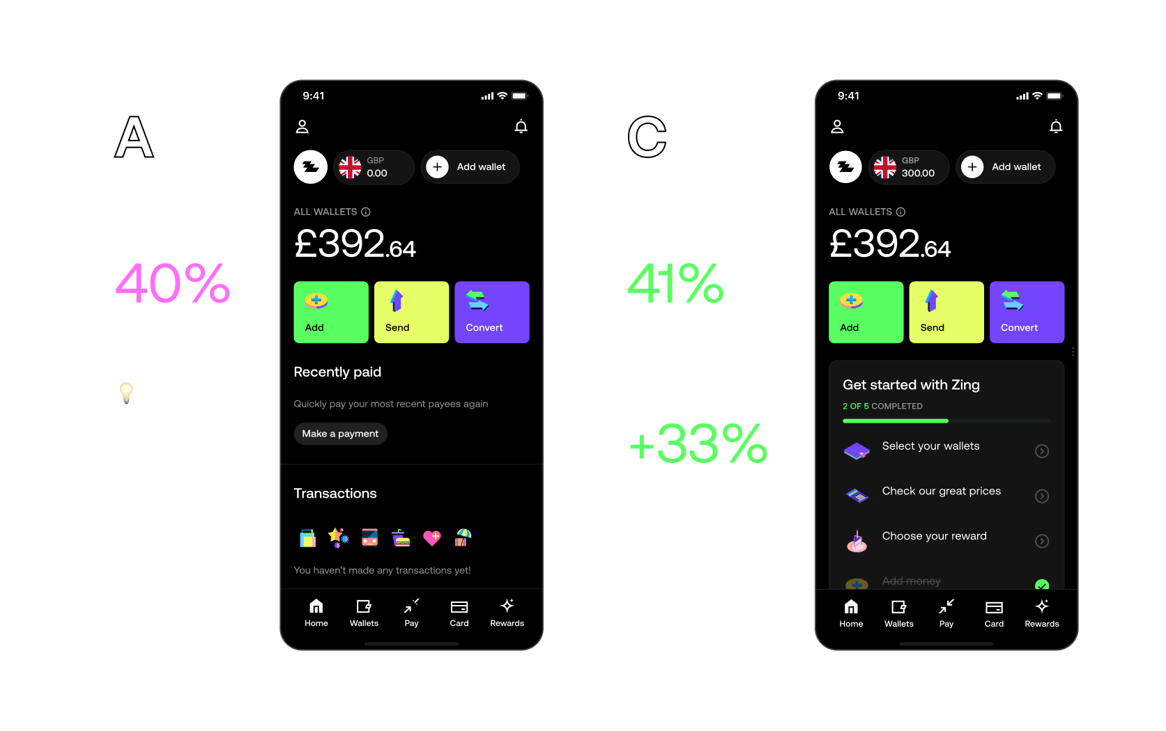
We ran multiple A/B tests to optimize user onboarding and engagement strategies, testing different approaches to welcome new users.
Our most successful variant achieved a 41% active rate and 33% higher revenue per user compared to baseline.
I led the creation of our design guidelines, working closely with a visual designer and copywriter to keep the system evolving as the brand matured. I designed most of the guidelines myself, coordinating with product and visual designers to define clear rules, visual strategies, and usage patterns across every touch point. This process helped the team stay aligned, remove inconsistencies, and maintain a consistent standard of quality as the product expanded.
I drove the tone of voice initiative forward each week, working with a creative strategist and copywriter who shaped the core narrative while I designed much of the system alongside a visual designer. Together we defined a clear voice, writing principles, and practical examples that helped the team stay consistent across product, marketing, and support communications.
Product Expansion
Scaling the product with new features and expanding market reach.
With Zing live in the market, we turned to scaling adoption and deepening the product. This phase moved us beyond the MVP — adding richer features, improving conversion, and solidifying HSBC's position as a credible fintech challenger.
Focused on growing the user base and driving adoption through improved onboarding, marketing, and product features.
Moved beyond the MVP by adding richer features, enhancing existing functionality, and improving overall product depth.
Improved conversion rates across key user journeys, optimizing flows to reduce friction and increase user activation.
Solidified HSBC's position as a credible fintech challenger through consistent product quality and user experience.
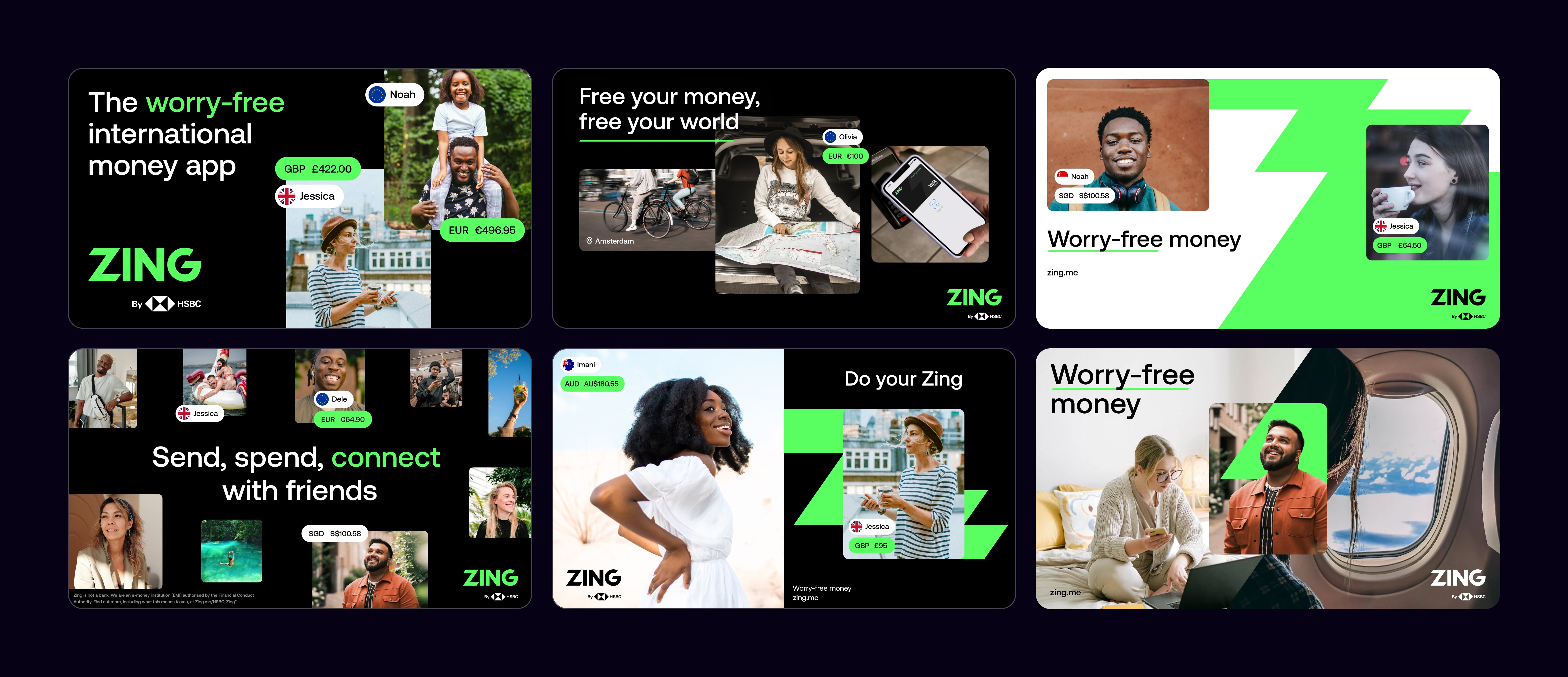
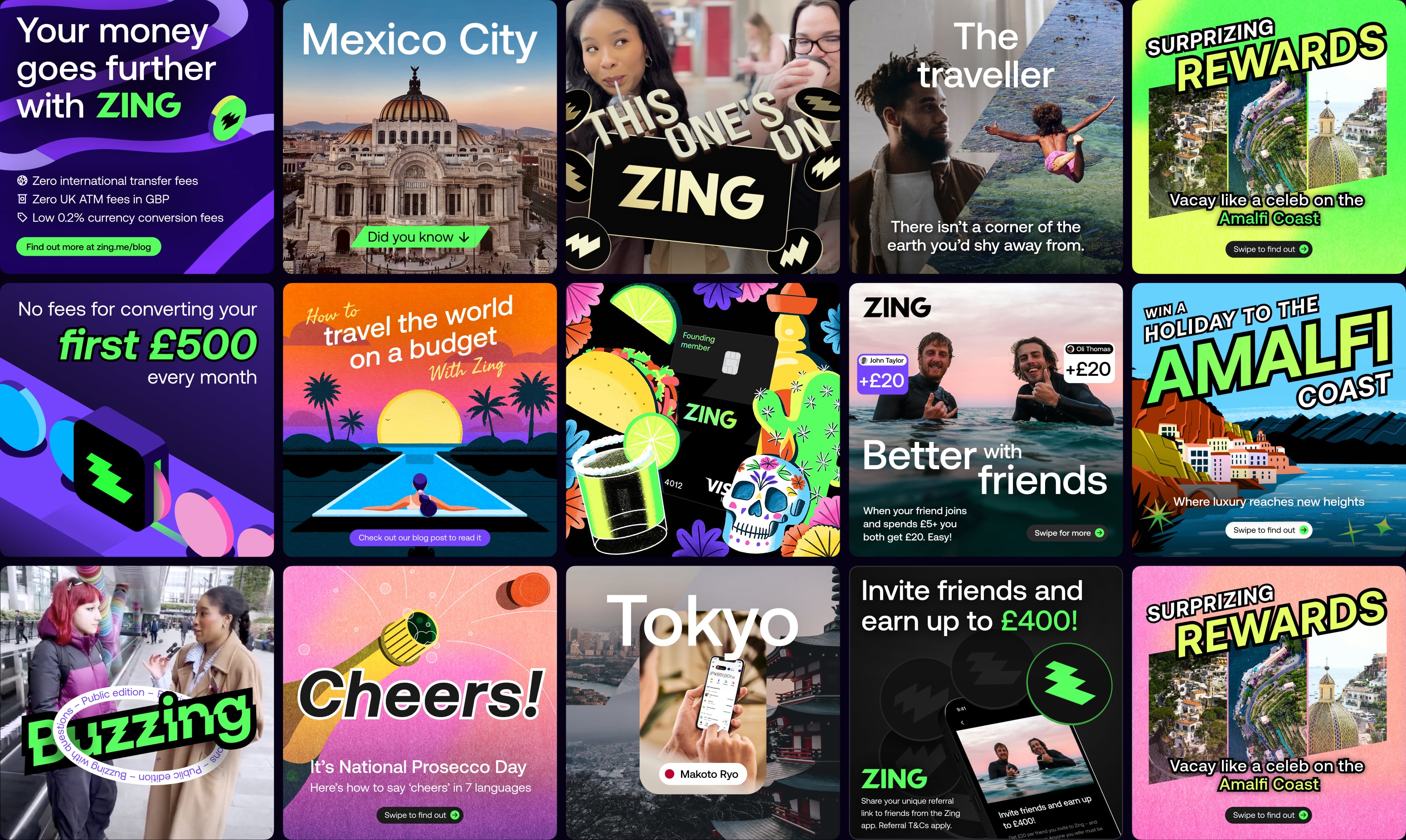
We created our unique selling propositions visually in modular formats that could be animated and displayed in succinct, easy-to-digest ways across both digital and printed formats. This modular approach made it immediately clear to customers how Zing is different and better than other competitors in the market, communicating our value proposition effectively wherever it appeared.
Lorem ipsum dolar sit amet consecteteur elit sed do eismod. Lorem ipsum dolar sit amet consecteteur elit sed do eismod adipiscing. Lorem ipsum dolar sit amet consecteteur elit sed do eismod adipiscing
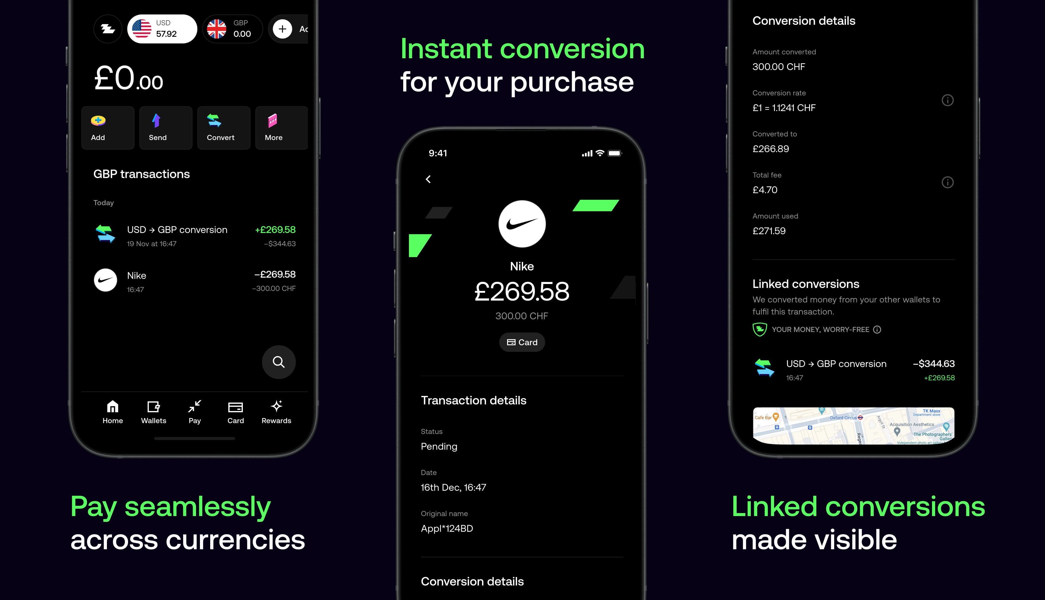
I designed a real-time payment tracking system that gives users complete visibility into their international transfers. Users can track FX payments as they move through intermediary banks, receive instant notifications when recipients are paid, and follow their payment's journey from initiation to completion. This transparency eliminates uncertainty and builds trust in cross-border transactions.
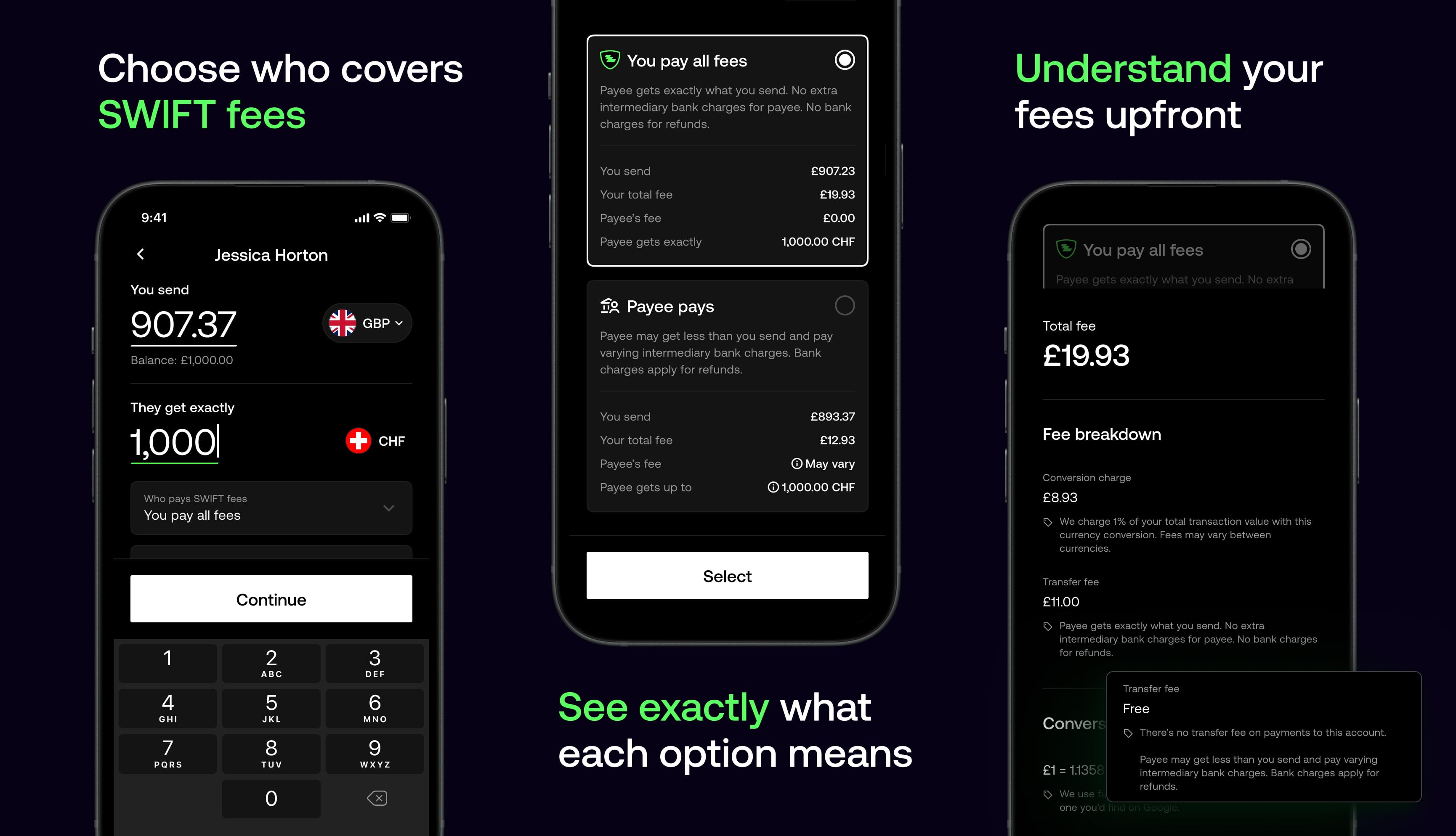
With shareable SWIFT fees, you can decide who pays the intermediary bank charges on every transfer. The app clearly shows how each choice impacts what the recipient gets and provides a full fee breakdown so there are no surprises.
When you don't have enough balance in a currency, FX Sweeping instantly pulls funds from your other wallets and converts them at the best available rate. The app shows a clear breakdown of each linked conversion, so you know exactly where your money came from and how much was exchanged.
I played a very hands-on role guiding our visual designers, setting up templates, creative direction and standards that balanced flexibility with consistency. I worked closely with the team to explore a wide range of visual styles while keeping key themes and elements aligned. This process evolved in parallel as I led the development of our brand and voice guidelines while the marketing strategy expanded across more use cases.
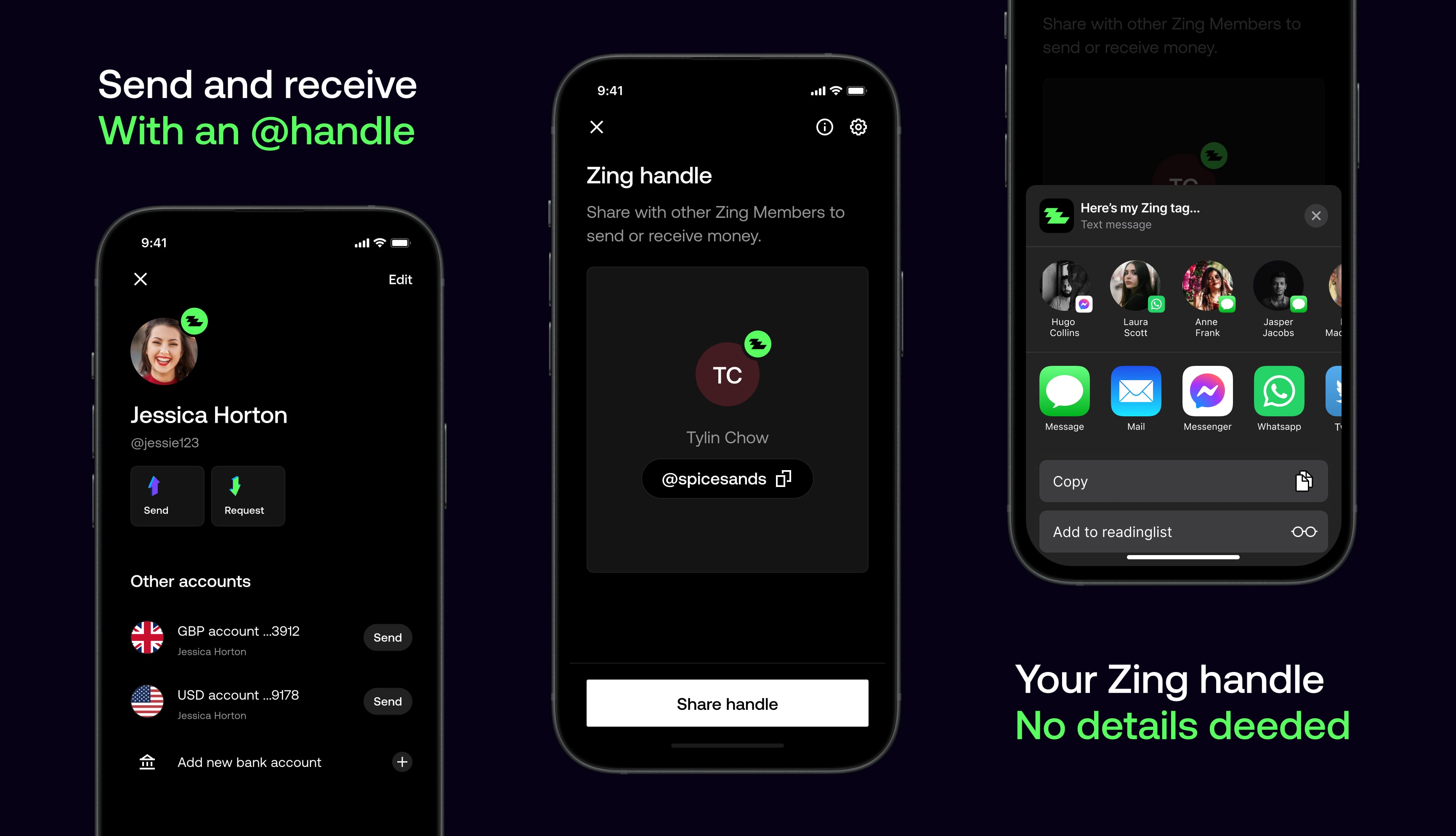
I collaborated closely with product designers to shape the payment handles feature, providing direction and design feedback throughout. The result was a more social payments experience that lets users send and receive money using a simple handle, without needing to share account details.
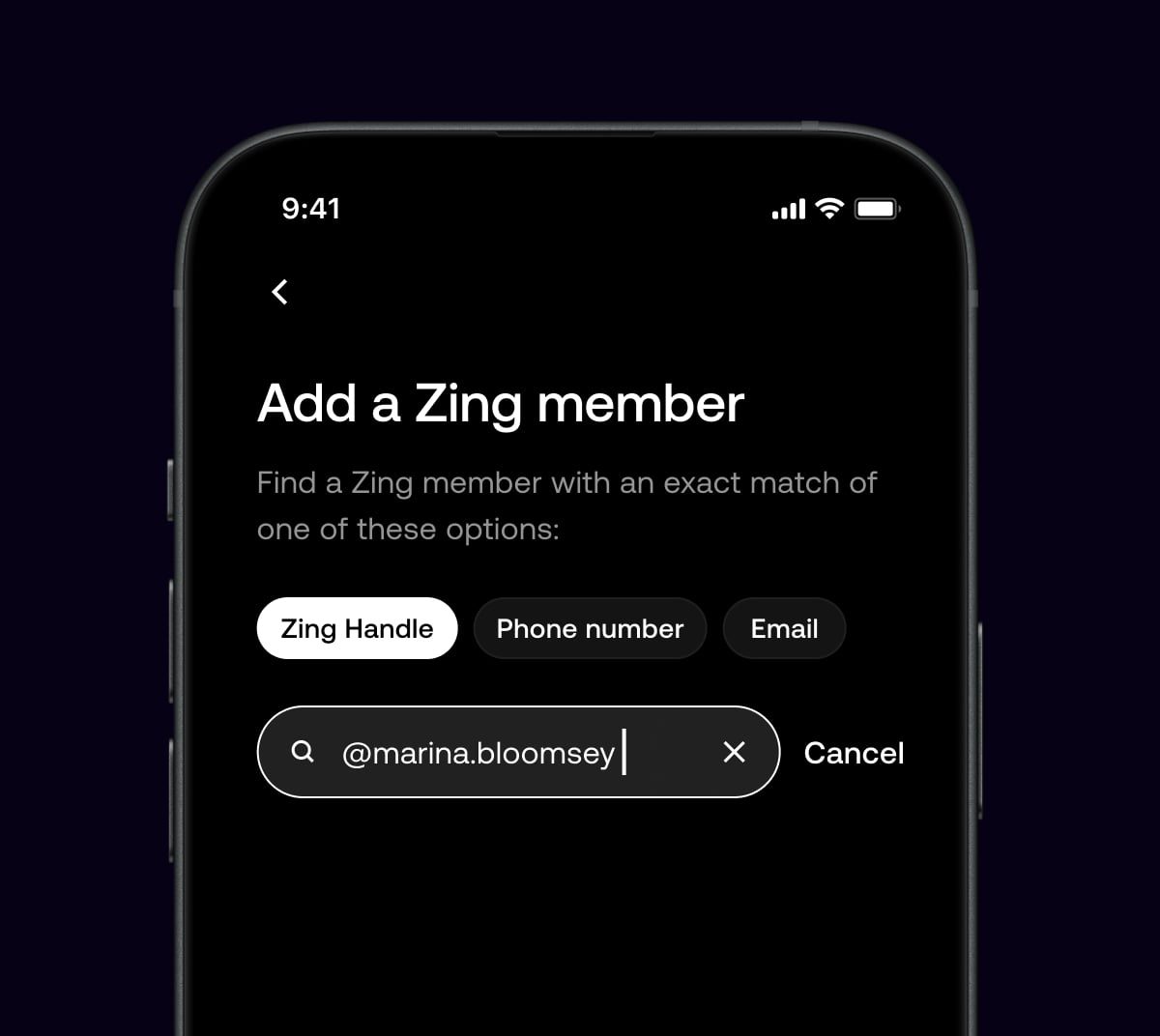
Each user is given a unique payment handle that represents them across the product. By sharing this handle, users can send or receive money without exposing account details, making payments feel more personal and better suited to social contexts like messaging apps and social platforms.
We validated the direction, customised the design system, ensured iOS/Android technical readiness, set up automated communications, and printed the physical card design without functionality.
As the product grew, so did the team. We added more designers, researchers, and developers to the team to help us build the product faster and better.
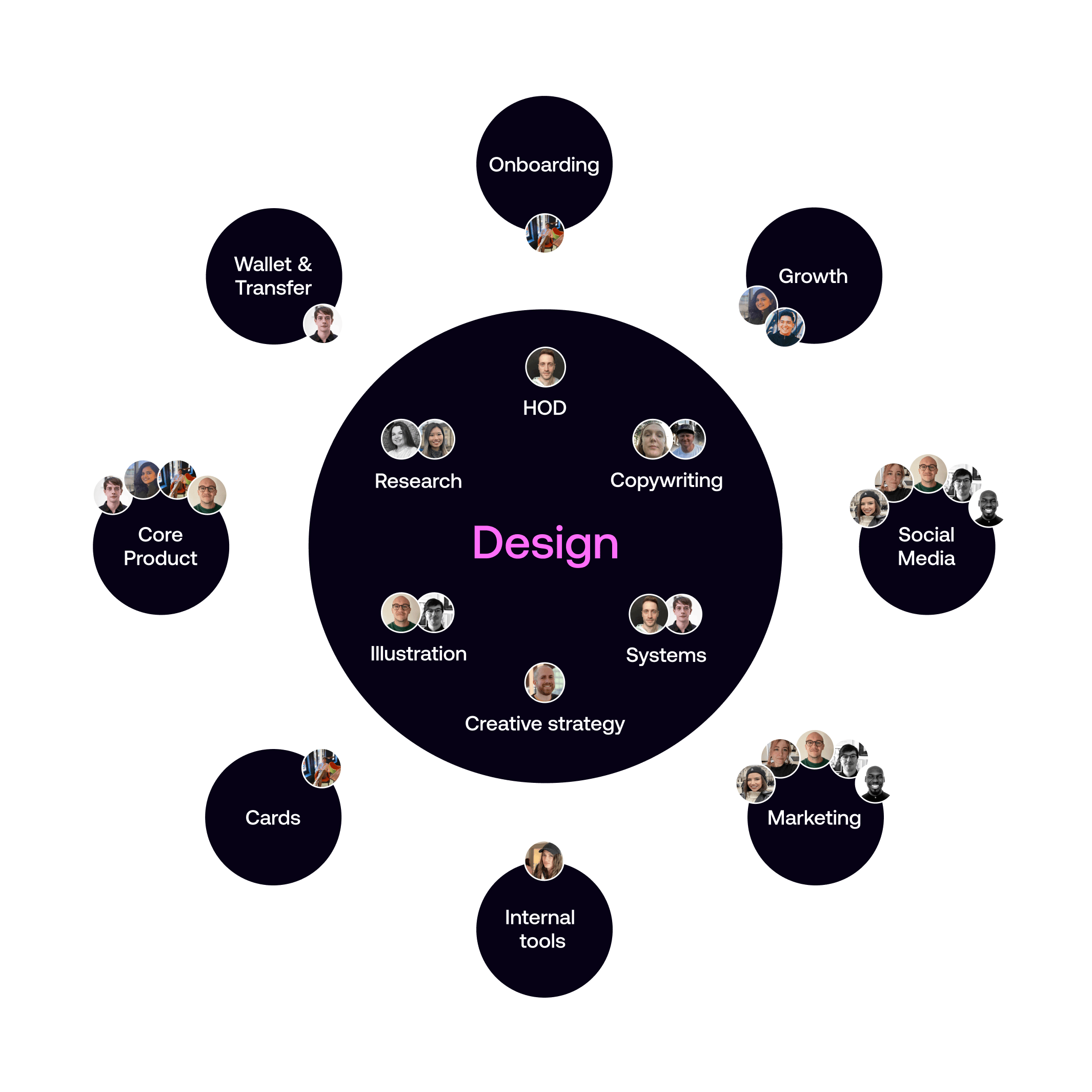
As the design team expanded, I established a central design leadership structure with myself at the helm, overseeing specialized design leaders across key domains.
This included dedicated leaders for Research & CRM design, Creative strategy, Product design, and Visual design, creating a hub-and-spokes model that ensured consistent design quality while allowing for domain expertise and focused leadership in each area.
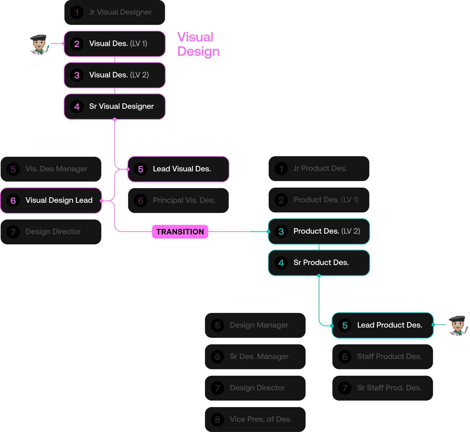
In 2017, one of our talented designers joined the team as a Visual Designer. Over the years, with mentorship he rose through the ranks in visual design. By 2020, he had not only excelled on the individual contributor path but also shifted to the management track as a Visual Design Lead.
Through ongoing guidance, we enabled him to transition into Product Design, where he rose to Senior Product Designer. Today he is moving into a Lead Product Designer position, demonstrating his adaptability and growth across disciplines.