
Next
I led Zing’s design organisation from early proof of concept through public launch: workshops with HSBC leadership to secure buy-in, a six-week PoC, and the foundations—principles, rituals, and systems—that let us scale quality without losing a single coherent voice. I hired and assembled a multidisciplinary team across product, visual, research, content, CRM, and creative strategy, and kept us aligned as priorities and headcount grew.
As the product matured I stayed hands-on in the craft—design guidelines, tone of voice, and cross-team initiatives—while mentoring product designers on major journeys. I also partnered with engineering to drive accessibility delivery, closing gaps systematically rather than leaving them as one-off fixes.

Once agreements were in place, I led workshops with HSBC leadership to map user needs, define design principles, and deliver a six week proof of concept that secured buy-in. This work established the foundations that guided design decisions moving forward and ensured we were ready to begin shaping the first working product.
Defining our target audience and their needs.
Establishing north stars to guide design and critiques.
Documenting the brand as a living, evolving system.
Setting how we write across phases and communications.
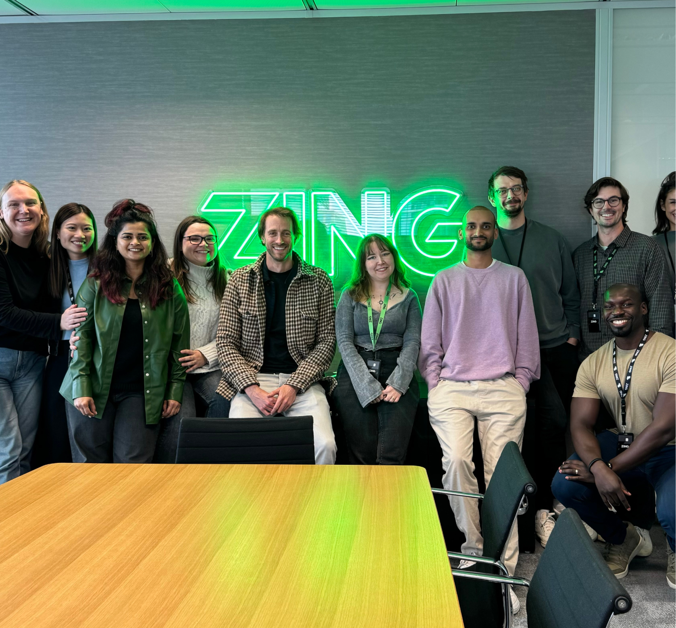
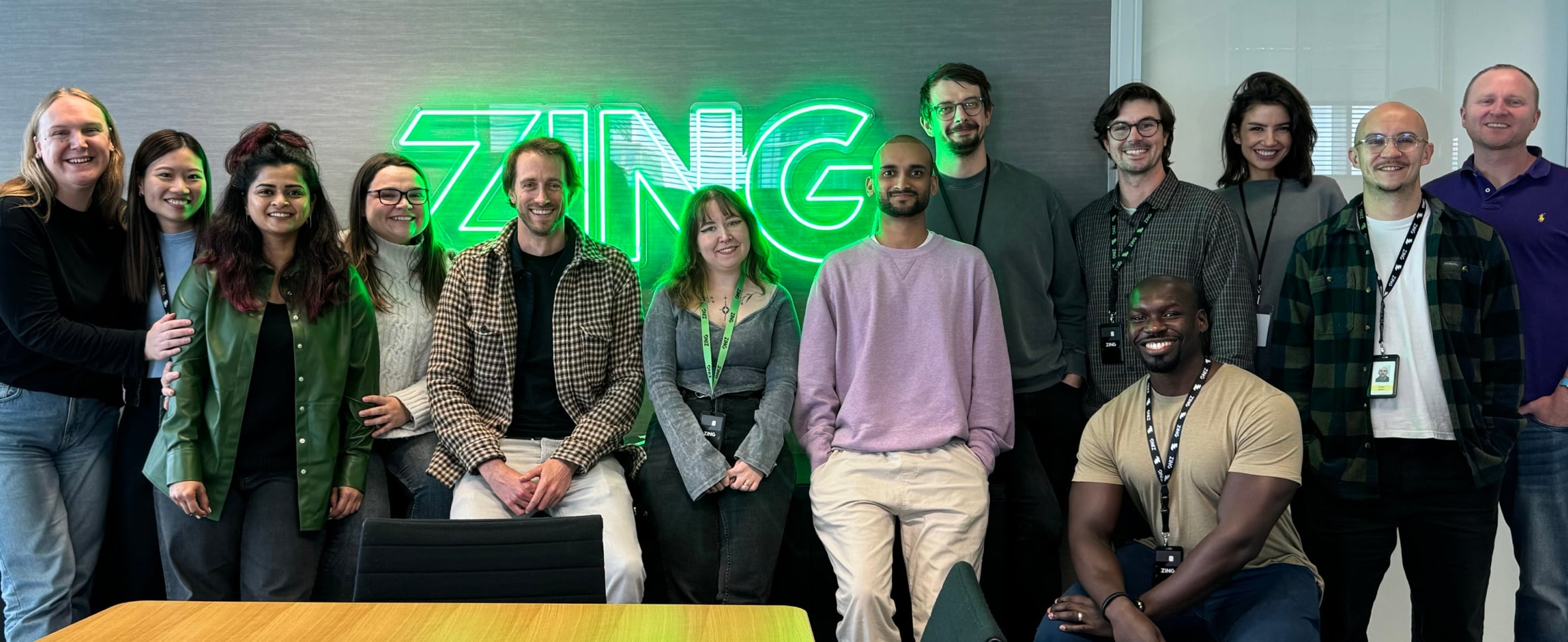
From an initial team of 2 (Me+1), I later hired and assembled a small multidisciplinary team, comprised of all disciplines of Design to lay the foundation for Zing's first version. When building the team, I looked for designers who were generative with ideas, had strong communication skills, demonstrated a strong work ethic, were personable, showed high user empathy, and possessed strong visual and UX craft.
While each designer's day-to-day work varied across different scrums and initiatives, I established a structured weekly rhythm that kept the team tightly together and cohesive. This consistent structure ensured we continually moved forward our strategic design org initiatives, which steadily levelled up the quality of design and UX. The result was a product that always felt like it was designed by the same hand, with the team operating as a consistent, shared knowledge brain despite working across different product areas.
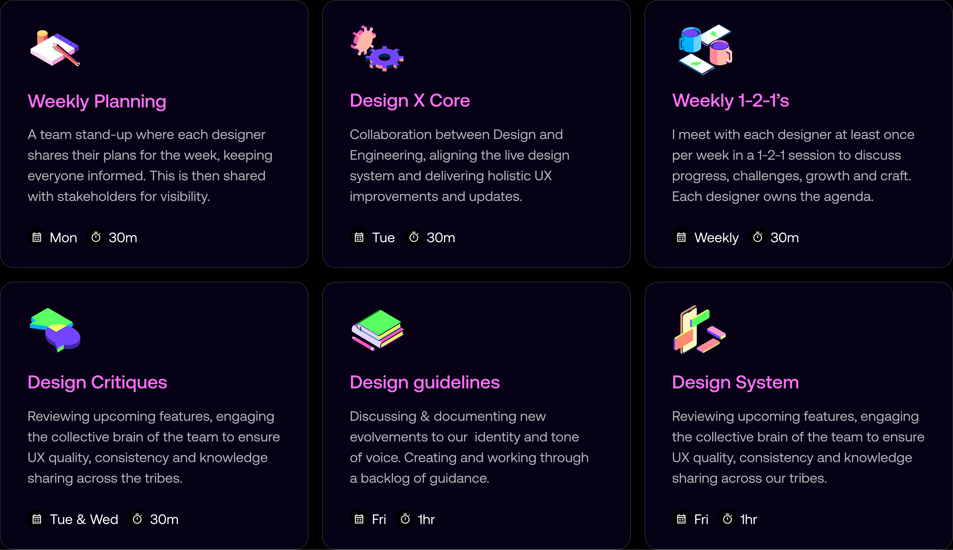
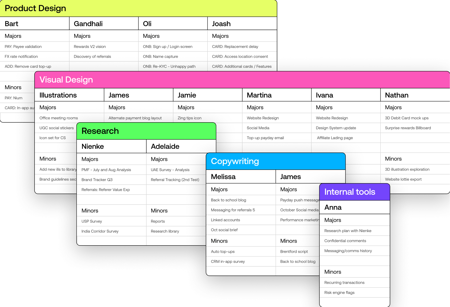
To ensure the design team could work effectively and deliver consistently, I established systems for alignment, visibility, and resource management. These processes enabled us to track initiatives, align with stakeholders on priorities, and balance workloads across the team's capacity.
Each Monday, the design team comes together for a 30-minute stand-up to align on priorities and workloads. Designers share their focus areas and upcoming deliverables, split into Majors and Minor initiatives, providing transparency and fostering collaboration. After the session, I update and share the sheet with stakeholders, providing insight into the team's capacity and helping streamline requests for new initiatives.
We progressed to setting up Asana boards for each key area of design, allowing us to track design initiatives and align with stakeholders on priorities. This structure enabled us to plan initiatives across available design capacity, ensuring we could balance workloads effectively.
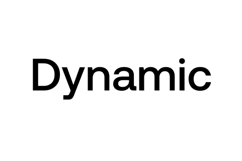
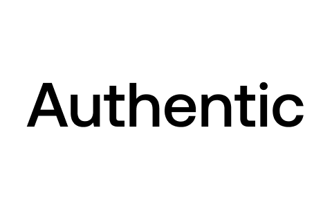
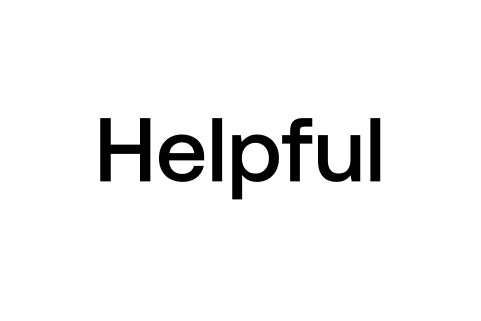
We defined a new set of principles: Dynamic, Authentic, Helpful, and Transparent, to guide decisions, align the team, and ensure consistency across every aspect of the product experience.
We used these principles as a framework to discuss and justify design decisions against. They anchored critiques and reviews, helping us clarify trade-offs and make informed choices on key product decisions like onboarding friction and fee transparency. The principles also shaped our visual craft, established a shared language across teams, and helped raise the bar on quality.
I led the creation of our design guidelines, working closely with a visual designer and copywriter to keep the system evolving as the brand matured. I designed most of the guidelines myself, coordinating with product and visual designers to define clear rules, visual strategies, and usage patterns across every touch point. This process helped the team stay aligned, remove inconsistencies, and maintain a consistent standard of quality as the product expanded.
I drove the tone of voice initiative forward each week, working with a creative strategist and copywriter who shaped the core narrative while I designed much of the system alongside a visual designer. Together we defined a clear voice, writing principles, and practical examples that helped the team stay consistent across product, marketing, and support communications.
As the product grew, so did the team. We added more designers, researchers, and developers to the team to help us build the product faster and better.
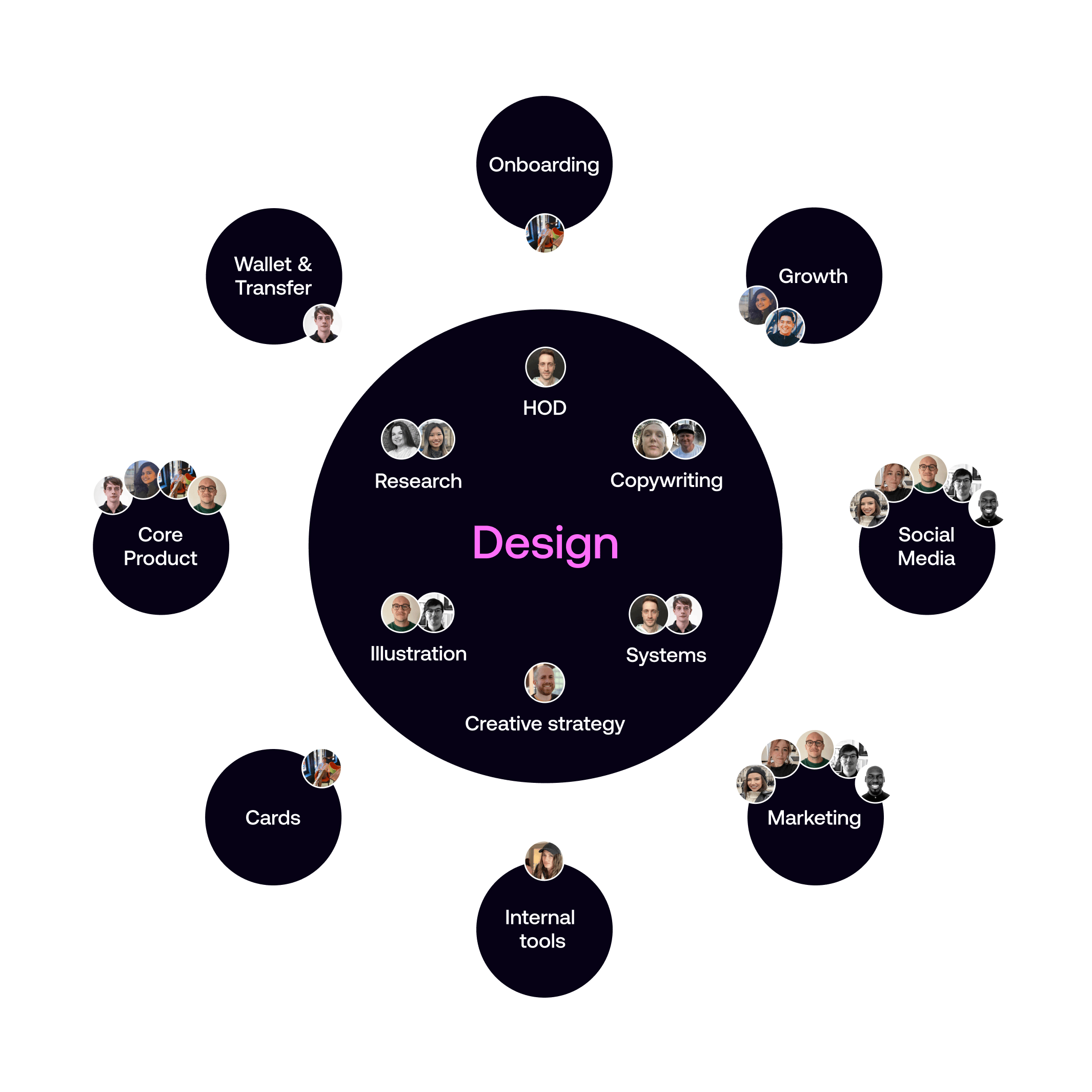
As the design team expanded, I established a central design leadership structure with myself at the helm, overseeing specialized design leaders across key domains.
This included dedicated leaders for Research & CRM design, Creative strategy, Product design, and Visual design, creating a hub-and-spokes model that ensured consistent design quality while allowing for domain expertise and focused leadership in each area.
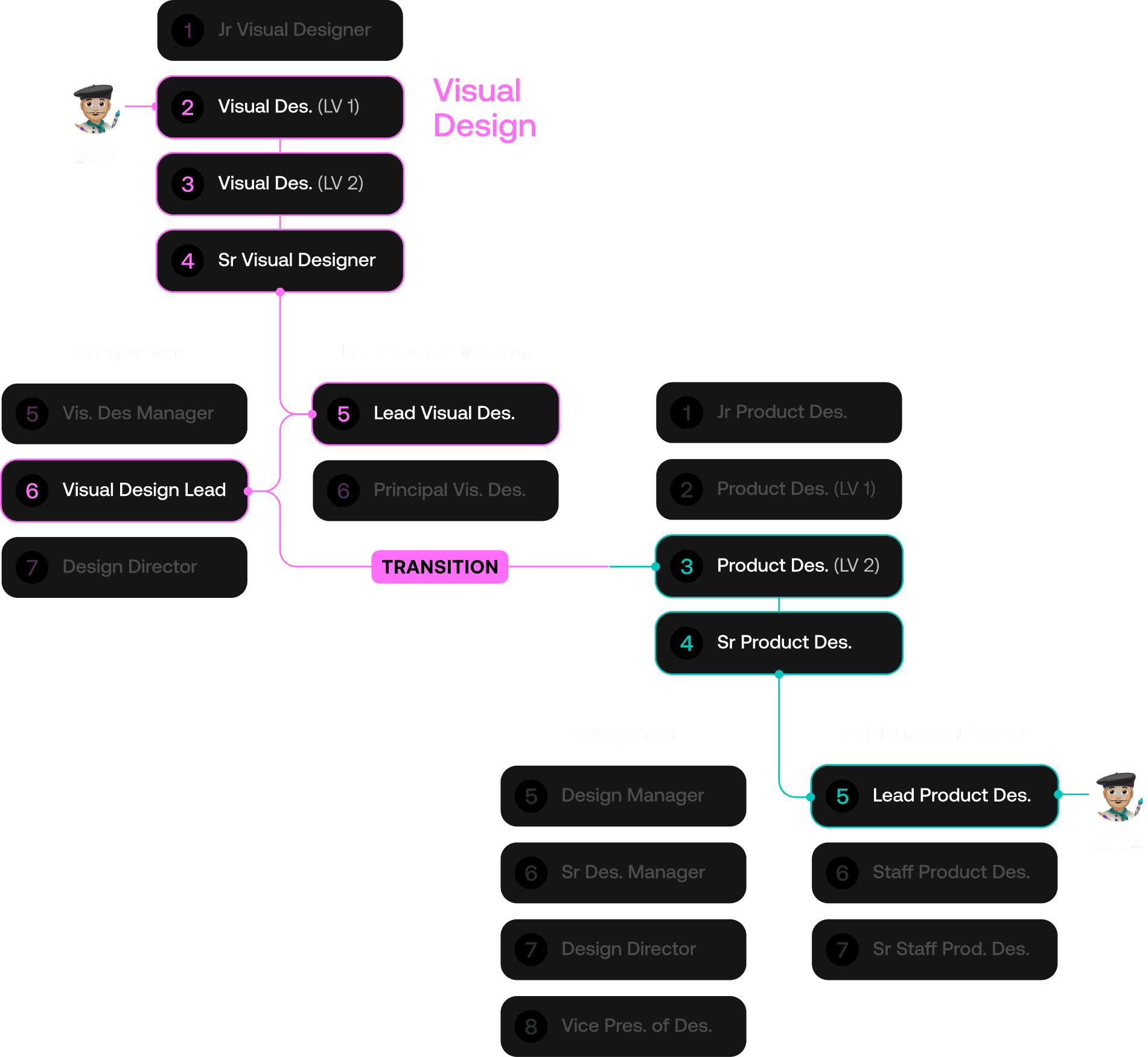
In 2017, one of our talented designers joined the team as a Visual Designer. Over the years, with mentorship he rose through the ranks in visual design. By 2020, he had not only excelled on the individual contributor path but also shifted to the management track as a Visual Design Lead.
Through ongoing guidance, we enabled him to transition into Product Design, where he rose to Senior Product Designer. Today he is moving into a Lead Product Designer position, demonstrating his adaptability and growth across disciplines.